
If you’re a business owner struggling with low sales and negative user feedback, it’s time to give your website a makeover.
In fact, websites that prioritise user experience (UX) see a thumping 400% increase in conversions compared to those that don’t. It means, bad UX is likely the reason behind your despair. In this article, we’ll show you important web design rules to follow and how you can create a user-friendly website that attracts, engages, and leaves a lasting impression.
Website Design Best Practices to Improve UX
Website design isn’t just about stunning images or unique buttons. At its core, web design is all about delivering the best experience when users browse your site.
Based on our decade-long experience in the field, here are some best practices you can implement to improve UX.
1. Promote User-Centric Design
When it comes to improving your website’s UX, the first step is to think about your user.
Design thinking, a human-centric design methodology first introduced in 1969 by cognitive scientist and Nobel Prize Herbert A. Simon, is key to achieving this.
While often associated with UI/UX designers creating user-centric web designs, design thinking can be applied across all industries to help business owners like you improve your user experience.
Design thinking is a non-linear process, meaning you can revisit each phase iteratively.
This approach allows you to continuously re-examine your website, challenge assumptions, redefine problems, and create innovative solutions considering your users’ needs.

“User-centred design is about deep research on users’ habits, from their interactions with the product to their vision of how the product should look and behave.”
As a business owner, you’ll be researching your users non-stop, keeping their needs at the forefront of every decision you make.
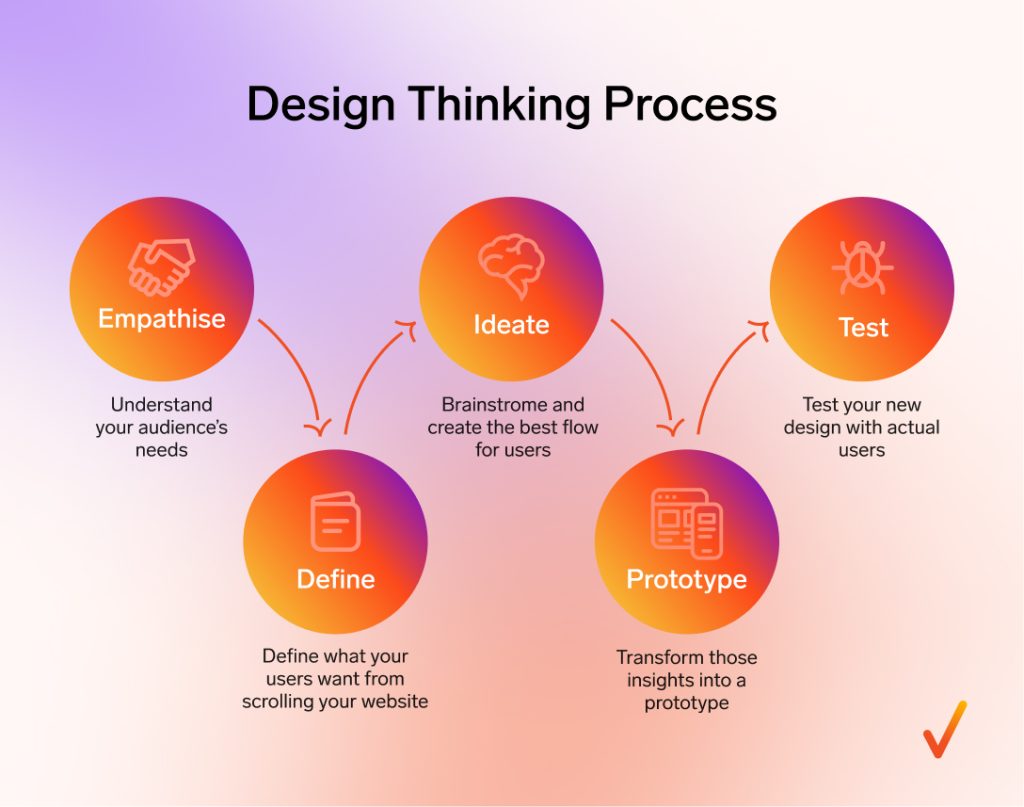
Now, let’s dive into the five stages of design thinking: empathise, define, ideate, prototype, and test.
- Empathise. Understand exactly your audience’s needs and frustrations. For instance, if you notice that customers are bouncing off your site without making a purchase, it could be because they can’t find the information they need.
- Define. Define what your users want from scrolling your website. For example, if user feedback suggests they want to read product reviews before buying, that’s your cue to start adding testimonials.
- Ideate. Brainstorm ways to create the best flow for users. Gather ideas from your team, talk to your existing customers, and take a look at what your competitors are doing.
- Prototype. After that, it’s time to transform those insights into a prototype, which is a rough version of your website design.
- Test. Test your new design with actual users. See if it improves their experience and if it helps boost your sales.
Don’t stop there. Keep learning your users behaviour and find out what they want!
2. Ptimise for Mobile Users

Did you know that 96% of users have experienced a non-mobile-friendly website? Your task is to ensure your website isn’t one of them.
A responsive web design means your site adapts seamlessly to different screen sizes, ensuring a smooth experience whether users are on a smartphone, tablet, or desktop.
One of the key characteristics of a responsive design is flexible layouts. This means your website’s grid and images automatically adjust to fit the screen size, avoiding awkward scroll bars or cut-off content.
Another important detail is the use of adaptive font sizes. On a smaller screen, text needs to remain readable without the user needing to pinch and zoom. A responsive design ensures that font sizes scale appropriately, so your content is easy to read on any device.
Images also play a crucial role. A mobile-optimised website might serve different images to mobile users, reducing file sizes for faster loading times without compromising on quality.
Don’t be afraid to embrace negative space. Allow your design to breathe by leaving enough space around elements, making it easier for users to focus on what matters most.
Additionally, touch-friendly elements are a must. These include:
- Buttons that are easy to tap
- Menus that are simple to navigate with a thumb
- Forms that are straightforward to fill out without needing to zoom in
3. Improve Your Navigation
According to a 2024 UX benchmark by the Baymard Institute, a shocking 76% of leading eCommerce websites have “mediocre” to “poor” performance in their Homepage & Category Navigation.
Even more concerning, 91% of sites don’t highlight the user’s current scope in the main navigation, leaving users feeling lost and frustrated.
Don’t make the same web design mistakes. Improve your navigation system with these tips:
1. Keep Navigation Simple and Intuitive
Your navigation menu should be straightforward and easy to understand. Avoid cluttering it with too many options. Instead, group related items under clear, concise headings.
For instance, if you run an eCommerce site, organise your products into broad categories like “Men,” “Women,” and “Kids” rather than listing individual items directly in the menu.
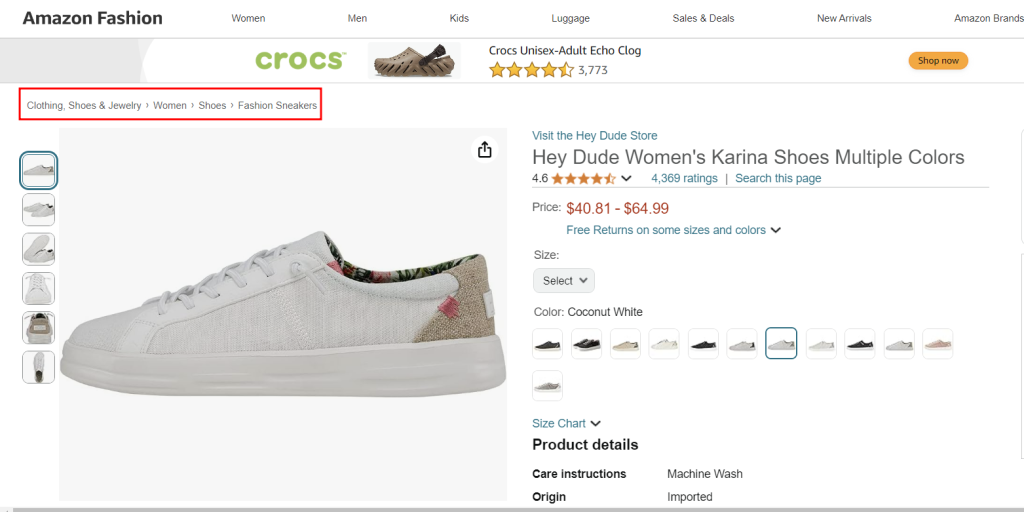
2. Highlight the User’s Location
One of the biggest issues identified in the Baymard Institute’s study is the lack of indication of the user’s current location on a site.
That’s why, you have to make it clear where the user is within your site’s structure. For example, if a user is browsing the “Women’s Shoes” section, ensure that this category is highlighted or underlined in the navigation menu.
3. Break Down Information into Digestible Chunks
When designing your navigation, it’s important to present information in small, manageable pieces.
“For instance, instead of presenting users with a long, complex form to fill out, break it down into smaller steps,” said Inchara Prasad, an editor at Weave Design.
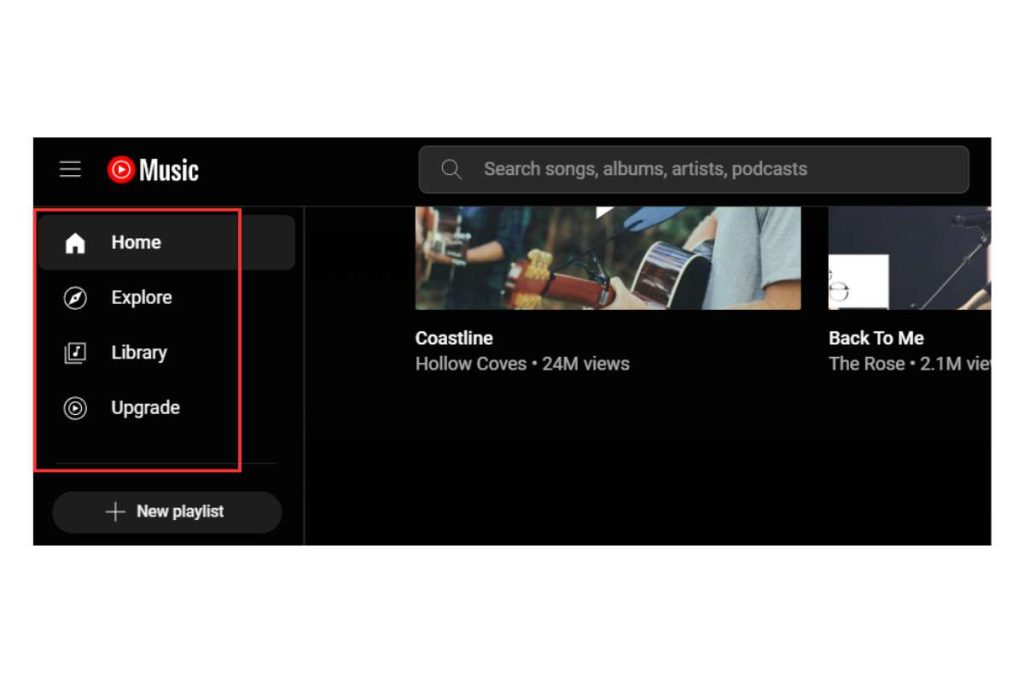
For example, YouTube Music employs a simple, clean navigation structure that doesn’t confuse users.
The menu is categorised into easy-to-understand sections like “Home,” “Explore,” and “Library,” so users can quickly find what they’re looking for without frustration.
4. Implement a Search Function (If Needed)
If your site has a lot of content pieces—such as reference pages, news articles, or hundreds of eCommerce products—implementing a search function is crucial.
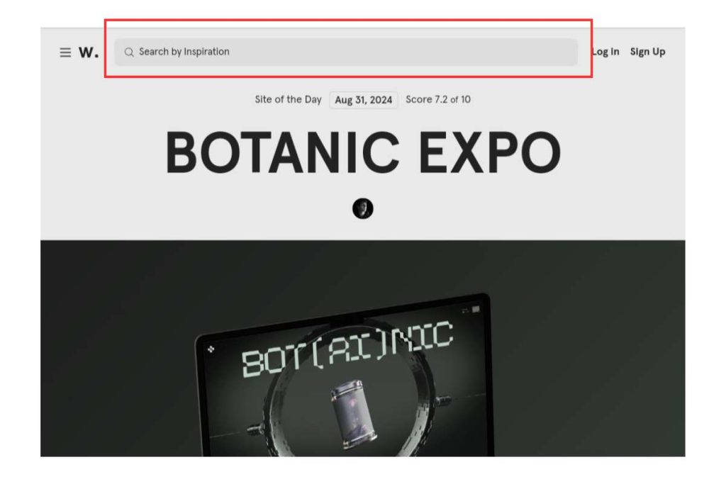
However, if your site is smaller, or if you’re aiming to guide users through a specific flow (as is common in marketing-focused sites), a search function might not be necessary—or even counterproductive.
In these cases, it’s often better to lead users directly to the most important content or actions you want them to take, ensuring a focused and streamlined user experience.
4. Incorporate Visual Hierarchy
The Nielsen Norman Group’s eye-tracking studies have uncovered several patterns that explain how people typically scan web pages, with the F-pattern and Z-pattern being the most well-known and widely applicable.
Those studies were downright game changer in the world of web design guidelines, let’s explore why:
The F-Pattern
The F-pattern is a natural scanning behaviour observed when users read text-heavy content like articles or blogs.
In this pattern, users first scan horizontally across the top of the page (forming the top bar of the “F”), then move down a bit and scan across again (creating the second horizontal bar of the “F”).
Finally, they scan vertically along the left side of the page, often focusing on the first few words of each line, forming the vertical line of the “F.”
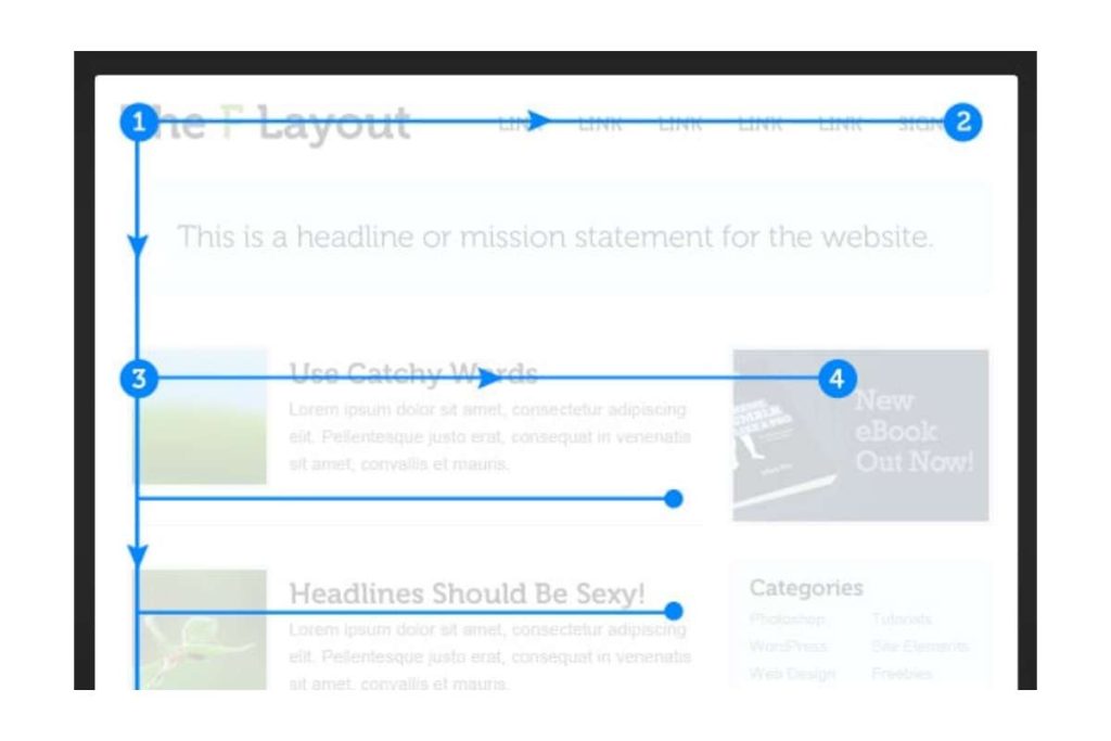
As Kara Pernice, President of Nielsen Norman Group, explains, “The F-pattern is the default pattern when there are no strong cues to attract the eyes towards meaningful information.”
This means that in the absence of eye-catching elements, users will naturally revert to this pattern.
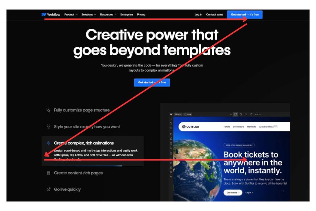
The Z-Pattern
This pattern is more common on pages with minimal text and a strong focus on visual elements, like landing pages or ads.
In this pattern, users start by scanning horizontally across the top of the page, then diagonally down and across to the opposite corner, forming the “Z” shape. The final horizontal scan takes place across the bottom of the page.
The Z-pattern works well for designs that aim to guide users through a specific journey, like moving from a headline to a call-to-action.
It’s particularly effective when there’s a need to quickly communicate a message or lead users towards a conversion point.
Check out here brilliant web design examples that use the Z pattern:
Based on the F and Z patterns, here are some ways to enhance your website’s visual hierarchy:
- Consider content placement: Place key information where the F and Z patterns are most likely to draw the eye—along the top, middle, and left edges of the page.
- Use headers and subheaders: Employ a clear hierarchy with headers and subheaders to guide users’ attention.
- Vary font sizes and styles: Use larger fonts for headlines and important information, while maintaining smaller, readable fonts for body text. Bold or italicise key points to draw attention.
- Use contrasting colours: Contrast helps certain elements stand out. Use a different colour for CTAs or important sections to ensure they catch the eye.
5. Boost the Page Load Speed
I know you’ve heard this a million times, but it bears repeating: page load speed is crucial.
According to Google, if your page load time increases from 1 second to 3 seconds, the bounce rate increases by 32%.
The slower your site loads, the more likely people will leave, as seen from the statistics below:
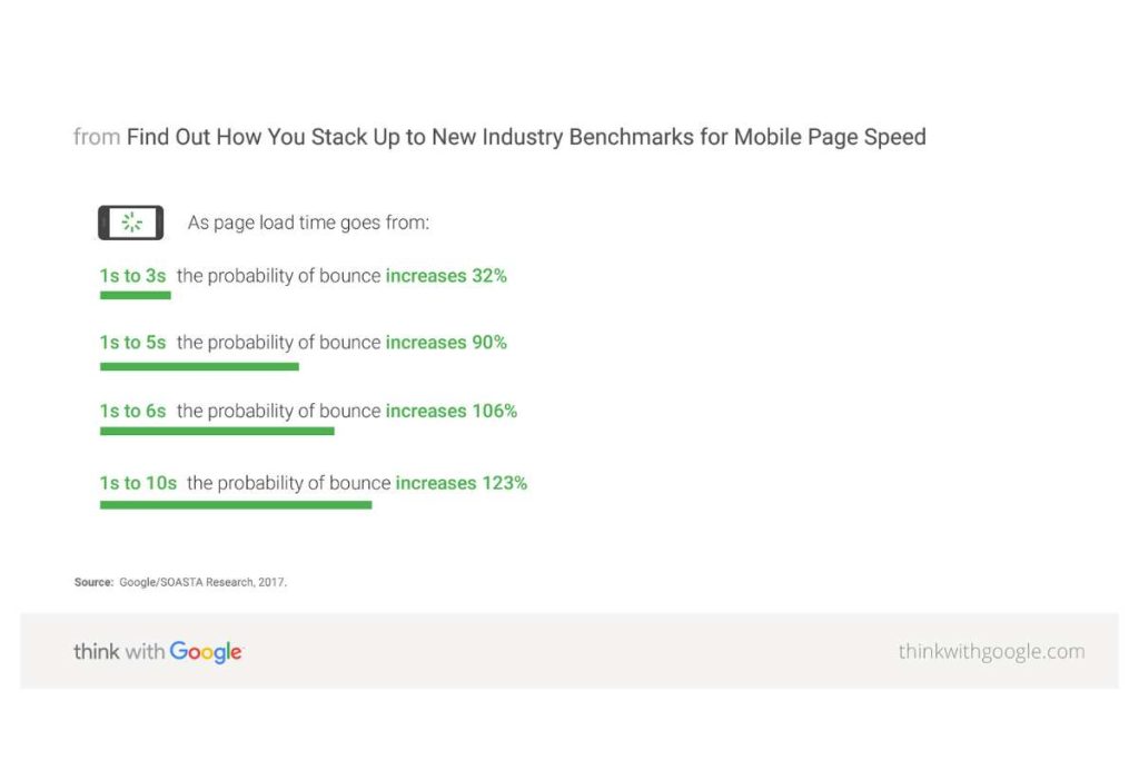
That’s a huge number, and it should make you realise that your website’s load speed really does matter—a lot! You can even say it’s one of the most important website design requirements.
The first step in improving your page load speed is to assess how fast (or slow) your site currently is.
Two of the most popular tools for this are Google PageSpeed Insights and GTmetrix. Those tools give you an overview of the culprits behind the sluggishness.
If your website is performing poorly, follow these tips to boost speed:
- Optimise images: Compress images without sacrificing quality. Additionally, consider using modern image formats like WebP, which offer better compression than traditional formats like JPEG or PNG.
- Minimise HTTP requests: Combine files where possible, such as CSS and JavaScript files, to reduce the number of requests. Also, consider removing any unnecessary plugins or widgets that might be adding extra requests.
- Defer JavaScript loading: Set your JavaScript to load after the main content of your page. This ensures that the essential parts of your site load first, improving the perceived speed for users.
- Minify CSS and JavaScript: Remove unnecessary spaces, comments, and characters from your CSS and JavaScript files to reduce their size. Tools like CSSNano and UglifyJS can automate this process for you.
- Enable browser caching: When a user visits your site, their browser stores some of the elements in its cache. By enabling browser caching, repeat users experience faster load times because their browser doesn’t have to reload the entire page.
Ultimately, every second counts, so make it a priority to keep your load times under control and deliver a smooth, frustration-free experience for your users.
Conclusion
Learning the best practices of web design to improve UX is just the first step in creating a website that truly resonates with your users.
Now that you’re equipped with this knowledge, it’s time to take action. Selecting the professional website design agency to bring these principles to life is crucial.
Onexcell has an exceptional track record of building websites that are not only visually stunning but also offer a seamless and comfortable user experience.
Ready to elevate your website? Contact us today!