
Having a well-designed website is key to attracting new clients and converting them into paying customers.
But the problem is, many small business owners and startups founders are still struggling to get their website design right.
So what are the common challenges entrepreneurs face when building a site? How can you solve those problems and beat your competitors? Read on to find the answers.
Web Design Challenges and The Solutions
Below, you’ll discover the web design challenges you might face — along with practical solutions you can apply right away.
1. Nailing the technical aspects

One of the biggest web design challenges is getting the technical stuff right. It’s not just about making things look good — it’s about how your website works behind the scenes.
If you don’t have any technical know-how, you can start by finding the best web designer near you.
A web design agency usually has the expertise and experience to not only create a stunning website, but also make sure it’s fast, responsive, and stable.
Solutions
- Define your tech stack: Determine what kind of front-end (HTML, CSS, JavaScript) and back-end (PHP, Node.js) technologies you need. Then, make sure your chosen developers are well-versed in these areas.
- Check the agency’s track record. Before choosing an agency, check its customer reviews and ratings on Google and sites like Trustpilot.
- Set up regular check-ins: Regular meetings with your development team ensure the project stays on track and keep everyone on the same page.
- Ask about scalability: Ensure the technology your agency is using will support future growth. If you plan to add more features or content, your website should be able to handle it without slowing down.
2. Offering the right solution to the users

It’s easy to get caught up in flashy designs and fancy features, but at the end of the day, your website needs to solve a problem.
As Marco Grossi, founder of Link1 Studios, put it: “Just last year I completed one of my biggest projects, a website with over 500 pages and several custom functionalities. And the client was satisfied. The question is: What problem are we solving? That’s it. Really.”
Think about it—every visitor lands on your website for a reason. Maybe they’re looking for information, a product, or a service. Your job is to make sure they find what they need quickly and easily.
Solutions
- Start with user research: Talk to your users, conduct surveys, or look at data to understand what they’re looking for and what problems they need solving.
- Define clear user journeys: Map out how users will navigate your website. Make sure their path from point A to point B is simple and logical.
- Prioritise essential features: Avoid clutter. Only include features and content that directly help your users solve their problem.
- Test with real users: Before launching, get feedback from real users to see if your website actually solves their problems and meets their needs.
3. Balancing UI and UX

It’s hard to ignore how fast the aesthetic trends are evolving. Of course, it’s tempting to chase the trend to show a better User Interface (UI). Most web design rules advise the same thing after all.
But as Arpita Gupta, Marketing Coordinator at Shark Ninja, wisely said:

Your website needs to look good, sure, but it also needs to be easy to use. You can take inspiration from web design examples we’ve curated, but there is still so much to go.
A flashy design isn’t going to help if your visitors can’t figure out how to navigate your site or find what they’re looking for. The trick is to balance a visually appealing interface with a seamless user experience.
Remember, it’s not just about what looks cool, but what works for your audience.
Solutions
- Prioritise usability over trends: Just because something is trendy doesn’t mean it’s right for your site. Focus on features that improve navigation and ease of use.
- Use design elements wisely: Stick to a clean layout with clear fonts and buttons. Ensure visual elements don’t overwhelm the user or distract from the content.
- Test for both UI and UX: Conduct usability testing to ensure your site is not only visually appealing but also functional and easy to navigate.
4. Creating an easy-to-use navigation
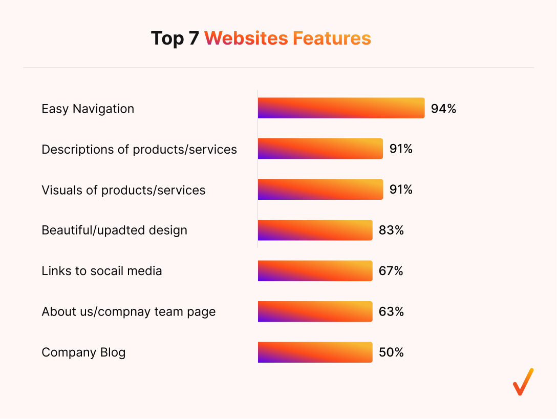
Another major challenge in web design is creating easy-to-use navigation. According to research, 94% of consumers said that easy navigation is the most useful feature of a website.
Think about it — if visitors can’t find their way around your site, they’ll quickly leave and look elsewhere. It doesn’t matter how great your content or products are if people are frustrated trying to access them.
Good navigation should guide your users naturally, helping them find what they need with minimal effort. It’s all about keeping things simple, intuitive, and user-friendly.
Solutions
- Keep it simple: Limit your navigation menu to the most important pages. Too many options can overwhelm users.
- Use clear labels: Avoid fancy terms. Stick to straightforward, common words like “Home,” “About,” or “Contact” so users instantly know where each link will take them.
- Highlight the user’s location: Make sure users always know where they are on your site by highlighting their current page in the navigation menu.
- Include a search bar: This is especially helpful for larger websites. A well-functioning search feature allows users to find what they need quickly without scrolling through multiple pages.
5. Speeding out your site
With attention spans getting shorter, a slow website can frustrate users and send them packing.
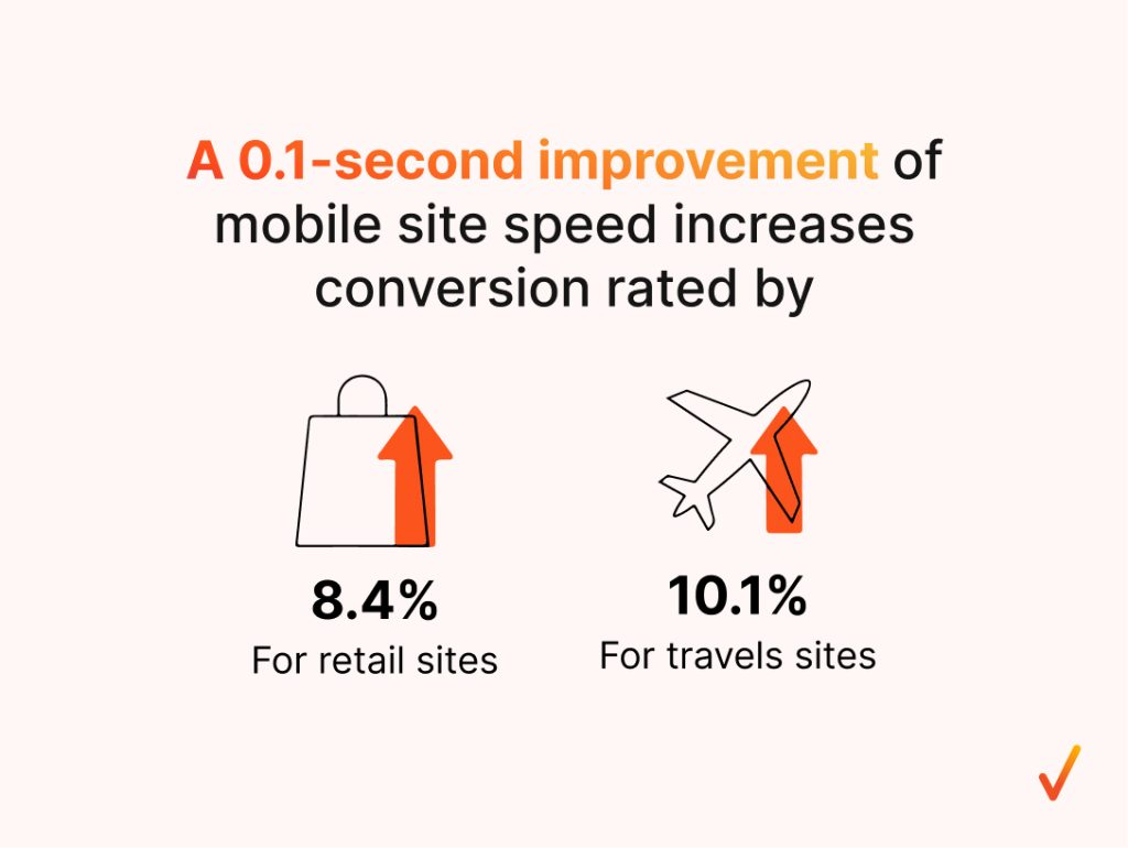
In fact, according to Google, improving mobile site speed by just 0.1 seconds can increase conversion rates by 8.4% for retail sites and 10.1% for travel sites. That small difference can have a massive impact on your bottom line!
Take Dakine, for example. They focus on site speed improvements through browser caching, image optimisation, and prioritising the content visible on mobile screens.
With this strategy, the site managed to improve its load times: the start page by 55%, category pages by 48%, and product pages by 65%.
The result? A 31% jump in mobile traffic, a 45% increase in mobile revenue, and a 4% boost in tablet sales over the following year. Speed matters, and it directly affects performance.
Solutions
- Implement browser caching: Allow your website to store files in users’ browsers so that when they return, the site loads faster.
- Optimise images: Compress and resize images without losing quality to reduce load times significantly.
- Prioritise above-the-fold content: Make sure the most important content, like headlines and key visuals, loads first on mobile screens.
- Minimise HTTP requests: Reduce the number of elements on a page that require loading, such as images, scripts, and stylesheets.
- Use a Content Delivery Network (CDN): Distribute your website across multiple servers worldwide, making it quicker for users to access.
6. Ensuring security
Security is not an option anymore. It’s a must-have for your website.
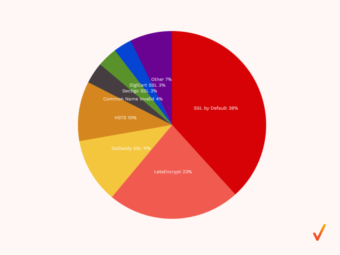
With over 317 million SSL certificates issued on the Internet as of August 2024, SSL by Default now dominates 38% of the web.
Why? Because users expect secure browsing, and search engines like Google actively penalise sites that don’t prioritise it.
First things first — what is SSL? SSL (Secure Sockets Layer) is a security protocol that encrypts data transferred between your website and its visitors, ensuring sensitive information like passwords and credit card details are protected.
When your site has SSL, it shows up as HTTPS (HyperText Transfer Protocol Secure) in the browser’s URL bar, with a padlock icon indicating that the site is secure.
HTTPS not only improves security but also builds trust with your users, making them more likely to engage with your site and complete transactions.
Solutions
- Install an SSL certificate: This is the most basic step in securing your site. Without it, users will see a “Not Secure” warning, which could scare them away.
- Switch to HTTPS: Make sure your entire website, including all pages and subdomains, runs on HTTPS. This will encrypt all data transferred between your users and your server.
- Use strong passwords: Secure the backend of your website with complex passwords and, where possible, enable two-factor authentication for added security.
- Keep software up to date: Regularly update your website’s software, including plugins and themes, to avoid vulnerabilities that hackers can exploit.
Regularly perform security audits: Conduct regular scans and audits to identify any potential security risks and fix them before they become a problem.
7. Enhancing accessibility

Enhancing accessibility is a crucial challenge that goes beyond just following guidelines—it’s about empathy and ensuring that every visitor, regardless of ability, can easily navigate and use your site.
A staggering 64% of pages have links that aren’t clear to people with disabilities, highlighting just how widespread this issue is.
As Chiara Cielo Longobardi, UX Designer at Deascuola, puts it: “Ensuring that a website is accessible is not an optional choice but a matter of empathy and respect toward its users. It is even a good marketing strategy: if a site is not accessible, the competitor with an accessible site stands to gain!”
In other words, making your website accessible isn’t just the right thing to do—it’s smart business. If you’re neglecting accessibility, you risk alienating potential users and driving them to competitors who have made their sites inclusive.
Solutions
- Use descriptive link text: Instead of generic phrases like “click here,” use clear, descriptive text that helps users with disabilities understand where the link will take them, e.g., “Download the annual report.”
- Provide alt text for images: Ensure every image on your site includes alternative text that screen readers can interpret for visually impaired users.
- Ensure keyboard navigation: Make your site fully operable via keyboard, ensuring people with motor disabilities can navigate without a mouse.
- Check colour contrast: Use high-contrast colour combinations for text and backgrounds so users with visual impairments can easily read your content.
- Add captions to video content: Ensure any videos on your site include captions or transcripts for those with hearing impairments.
8. Getting actual conversions
You might have the perfect website, but if it’s not turning visitors into customers, it’s not doing its job.
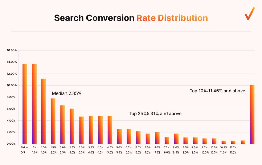
According to WordStream, the average website conversion rate is only 2.35%. But with a well-crafted Call-to-Action (CTA), that rate can jump to 11.45% or even higher.
This proves how important thoughtful design and strategic CTAs are in driving real results.
As William C McDowell’s study found, websites with higher conversion rates often contain flow-enhancing features.
In other words, design elements that guide users smoothly toward action, whether it’s making a purchase, signing up for a newsletter, or downloading content, are key to increasing conversions.
Solutions
- Use centred CTAs: Centred CTAs get 682% more clicks than left-aligned ones. Placing your CTA in the middle of the page draws more attention and makes it easier for users to take action.
- Keep CTAs above the fold: CTAs that appear above the fold (the section of the page users see without scrolling) outperform those below the fold by 304%. Don’t make your visitors search for it—keep it easily accessible.
- Make CTAs clear and compelling: Use strong, actionable language like “Get Started,” “Sign Up Now,” or “Download Free Guide” to make it clear what users should do next.
Are you ready to build a stunning website?
Web design challenges are inevitable, but it’s how you prepare for them that makes all the difference. From balancing UX and UI to boosting site speed and driving conversions, every obstacle is an opportunity to improve your website’s performance.
Why face these challenges alone when you can partner with the experts? At Onexcell, we’re here to help you build a website that not only looks great but works seamlessly to meet your business goals. Contact us now and let’s create something exceptional together!