Let’s face it, first impressions count – and in the digital world, that first impression happens in a blink. A mere 0.05 seconds, to be precise.
So, if you want to make a lasting impression and turn those quick glances into loyal customers, you need a website that’s not just functional but downright stunning.
Have no idea where to begin? This post will explore some of the best website design examples for your inspiration.

What are your Responsive Website Design ideas?
Given that over 60% of website traffic comes from mobile devices and tablets, it’s not surprising that responsiveness is one of the key web design best practices these days.
But what does it really mean to make a website responsive?
A responsive website is designed to adapt to any screen size, from tiny smartphones to massive desktop monitors.
It means the layout, images, and text will adjust automatically to fit the device perfectly. This ensures a great user experience no matter how people choose to access your website.
In this section, we’ll explore four good website design examples to inspire you:
1. Agoda
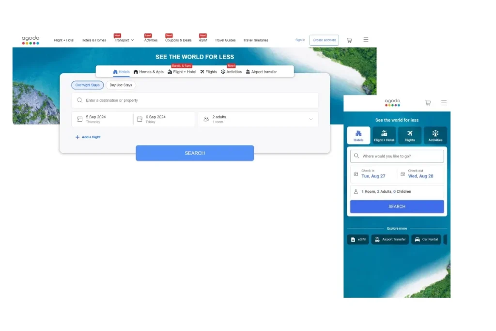
Agoda’s responsive website is a great example of how to maintain a brand’s essence across different devices while catering to the unique needs of each.
Whether you’re browsing on a desktop or a mobile device, Agoda keeps its signature phrase, “See the world for less,” front and centre. On mobile, this slogan is cleverly adjusted in typography to fit smaller screens without losing impact.
The website’s main focus—booking hotels—is consistently emphasised with the same clear and prominent CTA button across all devices. This ensures a seamless user experience, allowing visitors to quickly find and book accommodations, whether they’re at home or on the go.
One particularly interesting aspect of Agoda’s responsive design is how they prioritise features for different devices. On mobile, the eSIM option is conveniently placed on the far left, acknowledging that mobile users are more likely to need this feature while travelling.
In contrast, on the desktop version, it’s positioned in the middle, balancing with other features that might be more relevant in that context.
All these thoughtful design choices highlight how Agoda tailors its website to meet the specific needs of its users, no matter how they choose to access it.
2. ClickUp
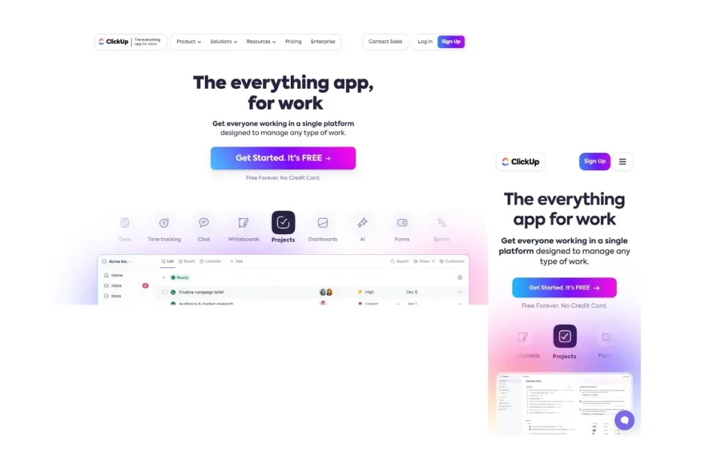
When you visit ClickUp’s website, one of the first things you’ll notice is how ClickUp transforms its top bar navigation into a sleek hamburger menu on the mobile version.
While it seems like a small change, using a hamburger menu simplifies the interface, making it easier for users to navigate on smaller screens.
The brand’s slogan also remains consistent across both desktop and mobile versions, with only a slight tweak in the typography’s boldness for the mobile view.
An essential feature that ClickUp retains in its mobile version is message support, which is crucial for users who might need help while on the go.
This sends an important message to the audience: ClickUp is committed to providing the best user experience across all platforms.
Additionally, ClickUp replaces all images in the mobile version, including the main page visuals, to ensure they are clearly visible and optimised for smaller screens.
Such attention to detail demonstrates ClickUp’s understanding of the importance of a visually engaging and user-friendly mobile experience.
3. Kozzee
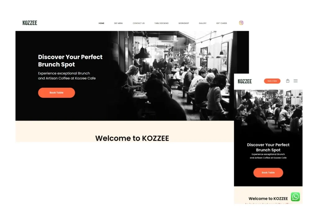
Kozzee, a small coffee shop, showcases an excellent example of how you create a responsive website for mobile users.
What’s particularly impressive is how Kozzee enhances its mobile experience by adding a shopping cart and an additional CTA button, “Book a Table,” directly in the top navigation.
These features are strategically placed to cater to the needs of mobile users, allowing them to easily make purchases or secure a table with just a few taps.
Moreover, Kozzee keeps the WhatsApp floating button on its mobile site. With this feature, customers can seamlessly connect with the coffee shop for inquiries or bookings, all at their fingertips.
4. The British Museum
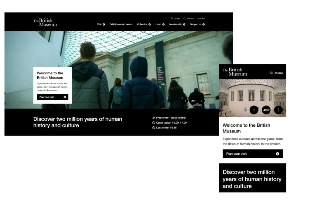
Like many well-designed mobile sites, The British Museum employs a hamburger menu in its mobile version, simplifying navigation without cluttering the screen.
One notable aspect of their design is the consistent use of a CTA button, which maintains the same text and style across devices but is strategically placed differently to suit the layout of each screen size.
Despite the challenges of mobile browsing, the British Museum manages to keep its engaging video content on the mobile version without compromising load speed.
As such, The British Museum can maintain user interest without frustrating them with delays.
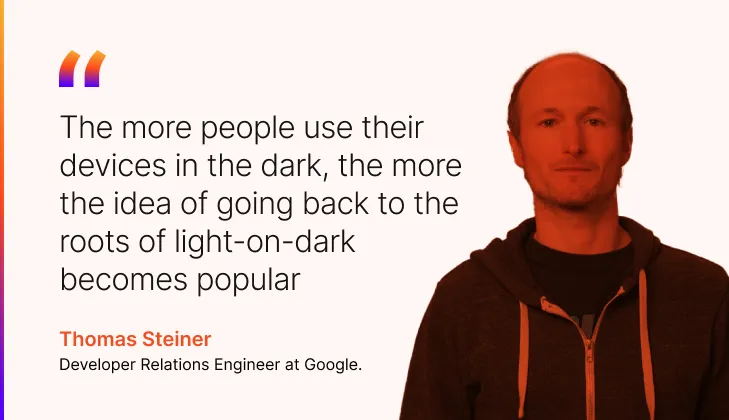
The website’s dark theme is another standout feature, especially considering that 81.9% of 2,500 Android users prefer dark mode on their devices, according to research.
This eye-catching design choice not only aligns with user preferences but also enhances the overall aesthetic, making the mobile browsing experience more enjoyable and visually appealing.
Clean Web Design Examples
A clean web design is all about simplicity and clarity. It’s a style that focuses on minimalism, using plenty of white space, straightforward navigation, and a limited colour palette.
By employing this approach, visitors can fully focus on your key messages without getting distracted. It’s easy on the eye and helps visitors focus on what truly matters—your content.
To get a closer look of clean web design, let’s explore these 3 examples:
1. Le Fruit
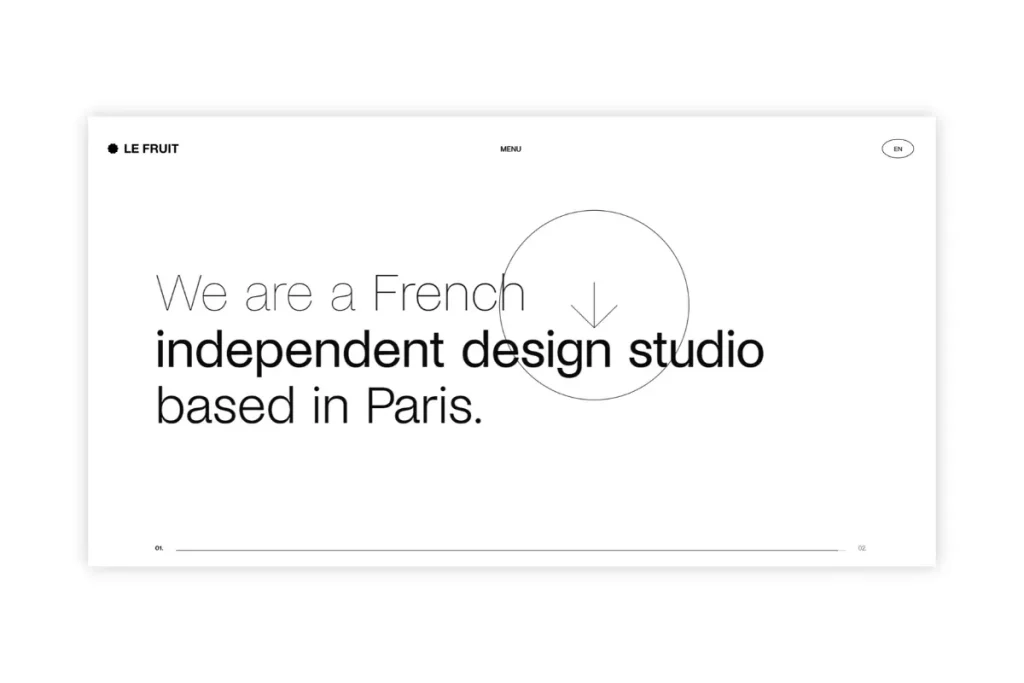
Le Fruit, a creative studio based in the Balkans, has mastered the art of clean web design with their minimalist and straightforward website. Right from the hero section, they make it abundantly clear who they are, leaving no room for ambiguity.
Combined with a sleek black-and-white theme that permeates the entire site, users will instantly get the feeling of a clean, uncluttered aesthetic that’s both modern and timeless.
Le Fruit smartly incorporates a large pointer that beckons visitors to scroll down. This pointer is not just static; it dynamically follows user cursor movements, adding an interactive element that subtly guides their journey.
What’s more, the hero text responds to user interaction, becoming bold as you hover over it, which keeps the reader engaged and adds a layer of sophistication to the experience.
Overall, Le Fruit’s website exemplifies the power of clean design. It’s minimalist yet full of character, ensuring that visitors are not only informed but also visually captivated from the moment they land on the page.
2. Skinome
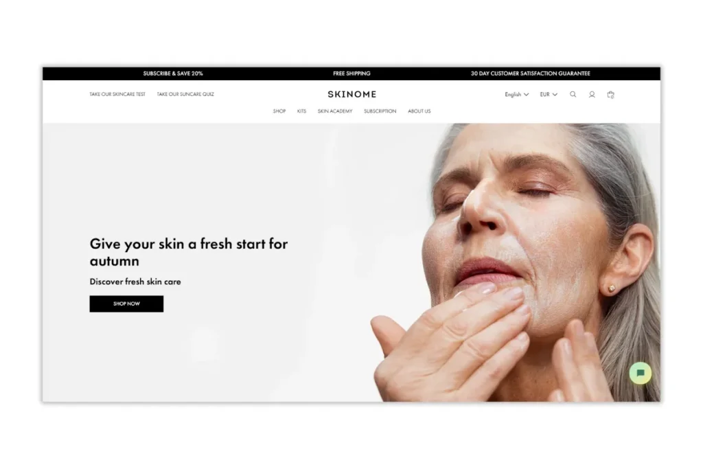
Skinome, a Swedish skincare brand, offers a clean and inviting web design that stands out without being overly minimalist.
When you first land on the website, the hero section catches your eye. It’s not the bare-bones minimalist style you might expect, but it still manages to maintain a clean and polished look.
As you explore further, you’ll notice the mega menu, which includes a dropdown menu that makes navigation simple and intuitive. The typography throughout the site is soft and easy on the eye, contributing to the overall comfort of your browsing experience.
One of the most striking aspects of the website is its predominantly white colour scheme, which aligns perfectly with Skinome’s product packaging—also white, with just a small image on the front.
By maintaining consistency in design, Skinome manages to reinforce the brand’s identity and create a seamless experience from start to finish.
Furthermore, the hero image features a woman with visible wrinkles, signalling that Skinome’s target market isn’t just young people.
This inclusion broadens the appeal and makes it clear that their products are for anyone looking to care for their skin, regardless of age.
All in all, Skinome’s website is an excellent example of a clean, well-thought-out design. If you’re looking to create something similar, adding it to your web design checklist is the right move.
3. Butter Insurance
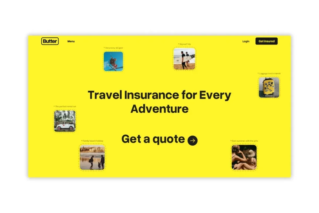
Butter Insurance, an Australian travel insurance brand tailored for Gen Z, has crafted a clean yet vibrant web design that breaks away from the traditional white-themed approach.
The entire website is a burst of colour, with the hero section drenched in bright yellow. It perfectly aligns with the brand’s name, “Butter.” This bold choice immediately grabs your attention and sets the tone for a smooth and playful experience.
One of the most intriguing aspects is how Butter Insurance plays with its typography. The slogan and CTA share the same typeface, but the CTA has a unique twist—it zooms in when you hover over it. This small yet captivating detail adds an interactive element that keeps you engaged.
Another interesting feature is the CTA at the top right corner, labelled “Get Insured.” It’s a straightforward and inviting prompt that aligns with the brand’s no-nonsense approach.
As you scroll down, the site becomes even more colourful, but the design is so well-organised that the colours never clash or overwhelm. Instead, they complement each other, maintaining a clean, harmonious aesthetic throughout.
Need to ask Something else?
Use the form here to send us your question. We’ll reply within one business day.
Need to ask Something else?
Use the form here to send us your question. We’ll reply within one business day.
Send Your Enquiry →Award Winning Web Design Ideas
Now, let’s shift our focus to award-winning web design ideas. These designs aren’t just impressive—they set the standard for excellence.
By avoiding common mistakes to make in web design, the following website examples excel at keeping users engaged and driving them to take action.
1. Grab and Go
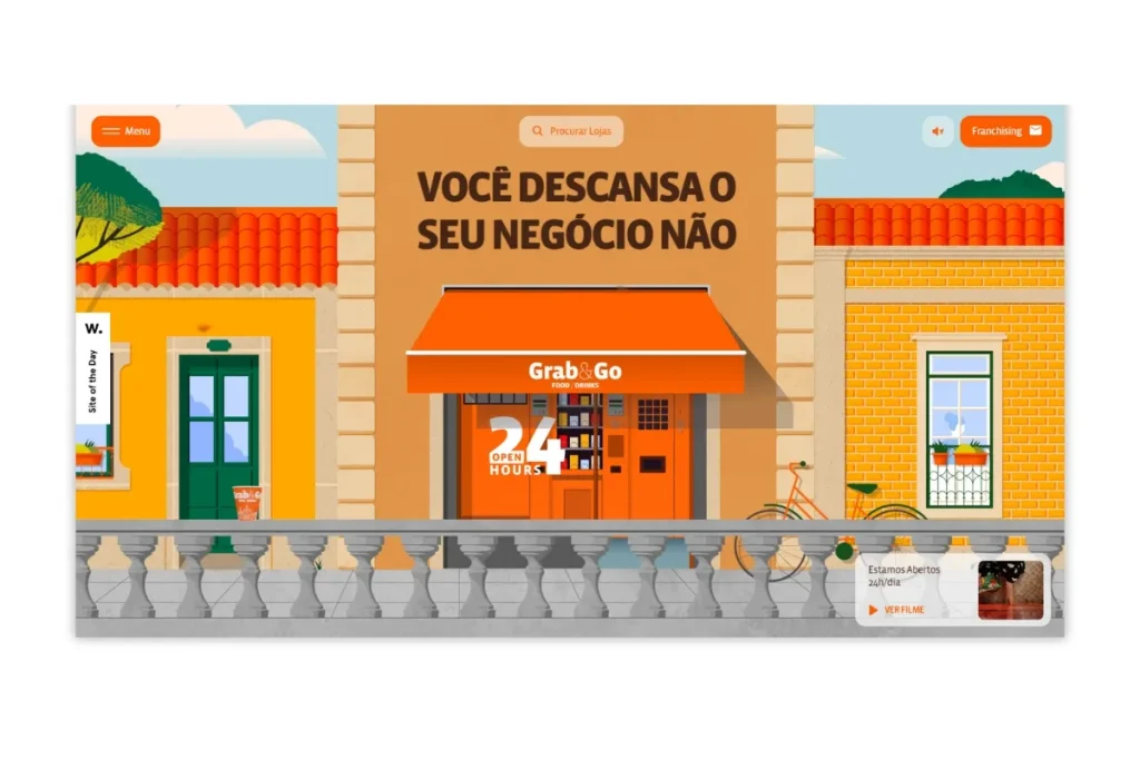
Grab and Go, the largest Portuguese vending machine network, has an outstanding web design that’s impossible to overlook, even if you don’t speak Portuguese.
The site is a visual feast, starting with an incredibly interactive hero section that features high-quality animations guaranteed to capture your attention.
As you scroll down, the creativity really takes off—the cup in the hero section “flies,” and snacks appear to dive into it, creating a dynamic and playful experience.
What sets Grab and Go’s website apart is its remarkable mouse interaction. The site responds to your movements in ways that are both surprising and delightful, making the entire browsing experience highly engaging.
Such a high level of interactivity and creativity is rare, and it’s easy to see why this site was named Site of The Day by awwwards.com.
It’s a perfect example of how imaginative design can turn a simple concept into an unforgettable online experience.
2. Critical Danger
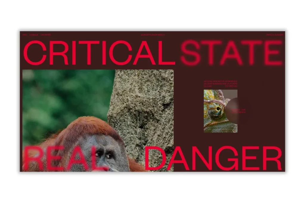
Critical Danger stands out among the websites we’ve discussed, offering a unique blend of education and interaction.
Created by a collective of designers to raise funds for charities supporting endangered animals, the site has earned its place as Site of The Day by awwwards.com—and for good reason.
The hero section immediately grabs your attention with a bold red backdrop that powerfully conveys the theme of danger. It really sets the tone for the site’s mission, reminding users of the urgency behind their cause.
What makes Critical Danger truly exceptional is how it combines education with interactivity. The website features stunning mouse interactions that make learning about endangered animals both engaging and memorable.
Navigating the site is not only informative but also an enjoyable experience that keeps you connected to the cause. It’s a powerful example of how web design can inspire action and drive social change.
Let’s Take Your Web Design to the Next Level
Having a well-crafted website is essential to attract, engage, and convert visitors.
Whether you’re inspired by the creativity of a clean design look or the impactful design of Critical Danger, our experts here at Onexcell have the skills to bring your vision to life.
Get in touch with Onexcell today, and let’s build the site you’ve always dreamed of!