
Imagine dedicating time and money for your website, only to discover that visitors are leaving within seconds. This is a common occurrence for business sites and online stores. As a matter of fact, the average bounce rate for eCommerce sites is 38.25%.
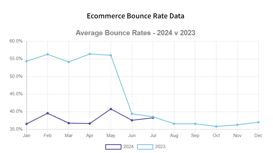
Although the number has decreased considerably compared to the previous year, this statistic is still alarming for business owners. A high bounce rate means fewer opportunities to convert visitors, leading to lower sales.
Unsurprisingly, a poor web design and slow loading times are among the leading causes of people leaving a website.
Don’t let this happen to you. In this post, you’ll learn common web design pitfalls other business sites make and how to avoid them.
Web Design Mistakes to Avoid
Before you build a website yourself or hire a web design agency, first you have to understand these common web design mistakes.
With this knowledge, it would be much easier to create a website that engages and converts users.
1. Cluttered Pages
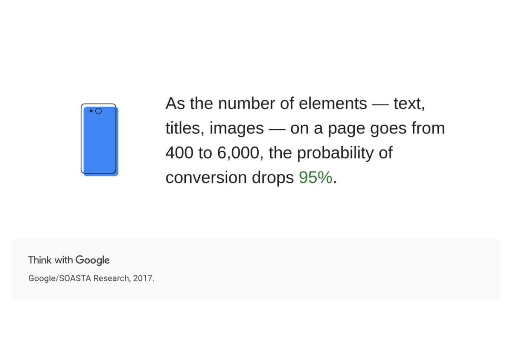
When it comes to web design, less is often more. Cramming too much information — text, titles, images — onto a single page can overwhelm your visitors and drive them away.
In fact, according to Google, as the number of elements on a page increases from 400 to 6,000, the probability of conversion drops by 95%!
A cluttered design can make it hard for visitors to focus on the important stuff. George Plumley, founder of See How Support, shared a great example:
“I have a client in the excavation business. They do a lot of things, but we boiled it all down to three key areas: septic systems, excavation, and trucking. That’s pretty much all you see on the home page.”
His approach proves that simplifying content can make a huge difference. It’s all about letting your audience know exactly what you do without overwhelming them with too much information at once.
Keeping your design simple and clean helps guide users through the website more smoothly, ensuring they find what they need without frustration.
2. Unresponsive Layout
If there’s one web design rule to follow, it’s ensuring your website has a responsive design.
This is because 70% of mobile searches lead to action within an hour, which means a poorly designed mobile experience can cost you big opportunities.
When a website isn’t responsive, it doesn’t adapt to different screen sizes. This leads to clunky navigation, distorted images, and text that’s either too big or too small.
As a result, visitors will quickly leave out of frustration. No one enjoys pinching and zooming just to read basic information.
On the other hand, a responsive website delivers a smooth user experience across all devices, from desktops to smartphones. Visitors can easily browse, find what they need, and interact with your content.
A well-designed, responsive website keeps people engaged and more likely to take action, whether it’s making a purchase, signing up for a newsletter, or contacting you directly.
So, when building a website, make sure to include responsive layout to your web design checklists. The cost of designing a website might rise significantly to ensure responsiveness, but that’s all worth it in the long run.
3. Slow Page Load
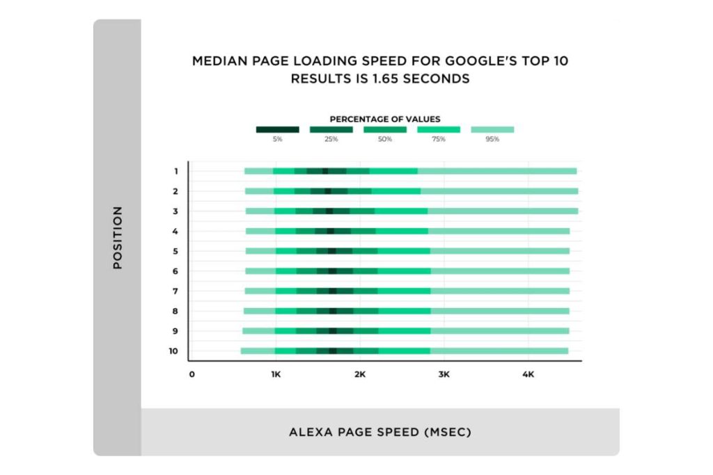
Another critical mistake to avoid is having a website that loads slowly. Ideally, you’ll want your website to load within three seconds.
For your information, the average page speed of a first-page Google result is 1.65 seconds. It shows just how important speed is for staying competitive.
A slow-loading website can frustrate users, causing them to leave before the page even fully appears. Research reveals that 53% of users abandon a site that takes longer than three seconds to load.
Not only does this affect user experience, but search engines like Google also consider page speed when ranking websites. So, a sluggish site could be costing you both visitors and search engine visibility.
Here’s how to fix slow load times:
- Optimise multimedia: Compress your images and only embed videos from YouTube, instead of uploading them to your server. Multimedia files are heavy, and they tend to slow down your site.
- Use a content delivery network: A CDN is a global network of servers. When someone visits your site, the content will be delivered from a server location closer to them, speeding up the loading process.
- Enable browser caching: It allows users to store your site content on their device, so they don’t have to reload everything from scratch each time they make a visit.
Also, consider optimising your code to ensure your website runs as smoothly as possible. But this is something that only a web developer can do. So make sure to find the best web designer near you.
The faster your site, the better the experience for your users—and that’s what keeps them coming back.
4. Generic Call-to-Action
CTAs guide users to take the next step, whether it’s signing up, making a purchase, or getting in touch.
But the thing is, generic CTAs aren’t appealing to users.
The difference between a basic CTA and a well-crafted, personalised one is significant – personalised CTAs perform 202% better than basic CTAs.
So, what makes a good CTA? Here are a few tips for creating a conversational and effective CTA:
- Use active verbs: Encourage action with words like “Start,” “Join,” “Discover,” or “Try.”
- Create urgency: Phrases like “Limited Time Offer” or “Sign Up Now” push users to act quickly.
- Address user concerns: Reduce hesitation by saying things like “No credit card required” or “It’s free!”
- Countdown clocks: If applicable, countdown timers can motivate users to take action before time runs out.
- Be clear and concise: Your CTA should be easy to read and understand in seconds. Avoid long or complicated instructions.
A great example of effective CTAs comes from Dropbox. In the hero section of their site, they feature a clear blue CTA button that reads “Sign up free”. Right underneath, it says “No credit card required,” removing any hesitation the user might have about signing up.
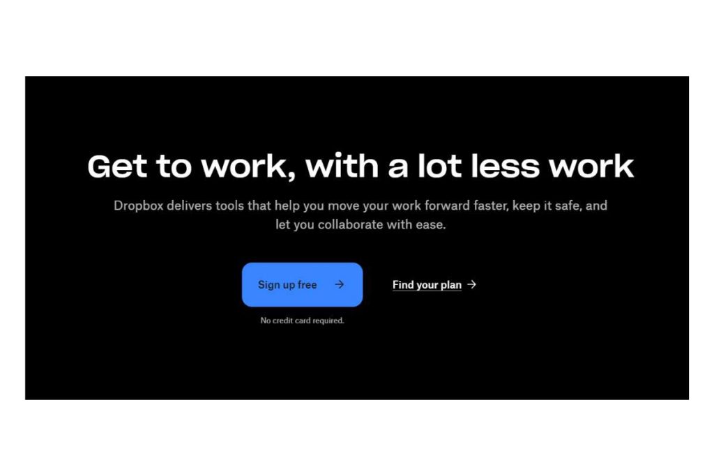
Additionally, they’ve incorporated a secondary CTA in the same section, saying “Find your Plan”.
The hierarchy of these buttons is well-defined, thanks to the choice of font style and colours, making it easy for users to spot the main action and secondary options.
When considering good web design ideas, this is a perfect example of how to create CTAs that are engaging, clear, and persuasive.
By using these techniques, you can guide users effortlessly toward the actions you want them to take on your site.
5. Inconsistent Branding
Inconsistent branding is one of the quickest ways to confuse your visitors and lose their trust.
When a website’s branding—things like colour schemes, typography, imagery, and overall layout—is inconsistent, it becomes difficult for visitors to understand who you are and what you stand for.
Consistent branding, on the other hand, reinforces your brand identity, builds recognition, and makes your website feel professional and trustworthy.
Take Cristina Gomez’s portfolio website as an example. It’s simple yet stunning, using a palette of only two colours and two typefaces.
The images she showcases are all from her own work, maintaining a minimalist and clean aesthetic.
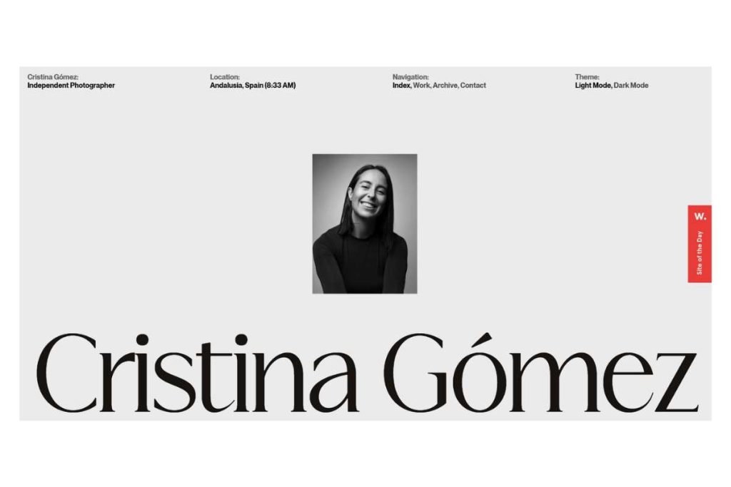
It’s clear from her website that her branding is all about professionalism as a photographer.
The simplicity reflects her style, while the limited palette and consistent imagery ensure that visitors immediately recognise her as a skilled, focused professional.
To create consistent branding, start by defining your brand’s personality. Are you fun and quirky, or professional and sleek? Once you have that, apply a consistent colour palette and typography throughout your website.
Additionally, use images and graphics that align with your brand’s tone and style.
Creating a brand style guide can also help maintain consistency, ensuring every element of your design matches your overall brand identity.
6. Unclear Visual Hierarchy
Visual hierarchy is how information is structured on your website. It guides users through your content in a logical way, helping them understand what’s most important.
When the visual hierarchy is poorly planned, users can struggle to find the information they need, and the overall experience feels confusing.
A well-designed visual hierarchy allows users to quickly scan your site and focus on the key elements. According to a study by the Nielsen Norman Group, users tend to follow F-pattern and Z-pattern layouts when scanning websites.
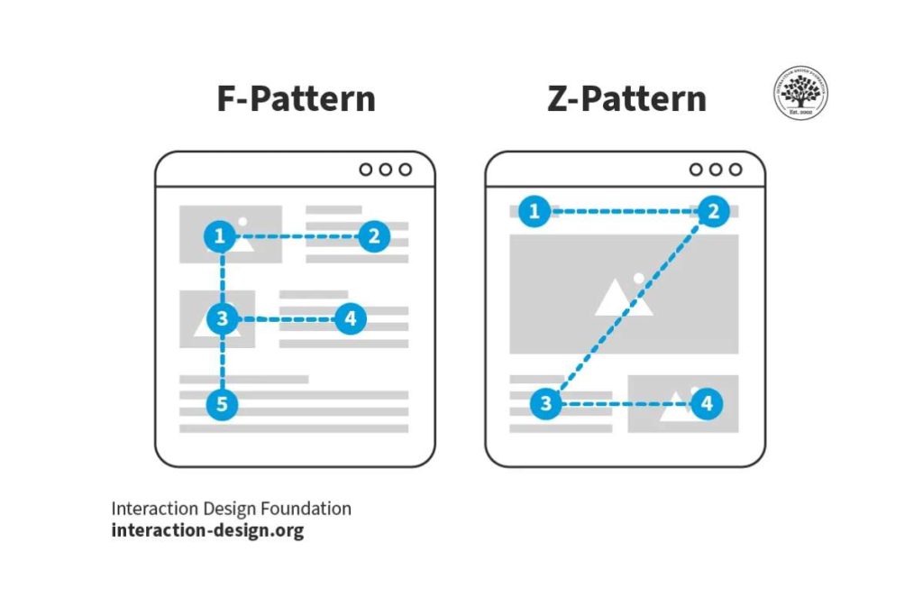
This means you should structure your content in a way that naturally leads the user’s eyes to the most important information, whether it’s a headline, a call to action (CTA), or a product description.
Natasa Hunjadi, a UX Designer, highlights this principle: “While reading is a learned skill, and most of the world reads from left to right, from up to bottom; the most important place, where the human eye is entering the design, is the upper left corner. That part of the design has a higher importance. That’s the place where the human eye will naturally start looking for information.”
To create a clear visual hierarchy, make use of font sizes, bold text, and contrasting colours to draw attention to key areas.
But don’t overwhelm visitors with too many colours. Stick to a maximum of two primary colours and two secondary colours for a balanced look.
The same principle applies to font sizes—limit yourself to three different sizes.
Moreover, use no more than three levels of contrast in complex designs. If everything stands out, then nothing truly does.
7. Irrelevant Content

While it’s not directly related to website design, content is the pillar of SEO. Your web design supports technical SEO, but content is your on-page SEO weapon.
If your website content doesn’t align with what your audience is searching for, your site will struggle to rank in search engines, regardless of how beautiful the design is.
53% of shoppers do research before purchasing, so having relevant, informative content that addresses your customers’ needs and questions is essential. Posting irrelevant content is a quick way to disengage users and drive them away from your site.
When visitors land on your page, they want to quickly find the information they came for. If you’re bombarding them with unrelated content or too much self-promotion, you risk losing their attention.
For example, if you run a plumbing website, your content should focus on providing helpful tips and services related to plumbing. Talking about unrelated topics like gardening or home decor will confuse your audience and dilute your message.
To avoid this mistake, conduct thorough research to understand your audience’s pain points and create content that speaks to their needs.
Use customer feedback, social media interactions, and industry trends to shape the topics you cover.
In addition, keep your content concise and relevant, so your readers can easily find what they’re looking for without getting lost in unnecessary information.
8. Unclear Navigation
When it comes to navigation, simplicity is key. Unclear navigation can frustrate visitors, making it difficult for them to find the information they need.
If your menu is cluttered or the layout is confusing, users are likely to leave and search for an easier alternative.
According to research, 67% of mobile users will leave a website if they are frustrated with the navigation, meaning you could be losing a large portion of your mobile audience with poor navigation design.
To improve navigation, use descriptive labels for your menu items so users immediately understand where each link will take them.
Ensure that your website’s navigation is consistent across all pages, so users don’t have to relearn the layout as they explore different sections of the site.
Include a search bar in a visible position, especially for larger websites, and consider breadcrumb navigation to help users keep track of their location within the site.
Clear and logical navigation makes it easier for visitors to browse, leading to higher engagement and a better overall user experience.
Conclusion
In a nutshell, steering clear of common design mistakes like overcrowded pages, unresponsive layouts, inconsistent branding, and unclear navigation can make a world of difference for your website.
A clean, easy-to-navigate site with strong branding and engaging content will keep your visitors happy and coming back for more.
If you’re looking to give your website a boost, Onexcell is here to help! Trusted by 200+ companies, we only create a beautiful, user-friendly site that’s designed to impress.
Send us an email to discuss further!