
You’ve likely heard the old saying, “There are no rules in art”, and the same thing can also be said about web design.
Creative people like web designers tend to avoid rules and formulas, as those will only limit their imagination.
But you can only break the rules if you know the rules.
If you want to create a website that’s both easy to use and pleasing to the eye, you must first learn the principles of website design.
Once you’ve mastered the art, only then can you defy expectations and create something truly innovative.
Understanding Web Design Basics
Web design has many layers and nuances, but it all boils down to these five crucial elements:
Layout

The layout of a website deals with how the content is structured on a page. A good layout guides the visitor’s eye naturally, making it easy to find important information.
Nowadays, most websites use responsive layout for a smooth user experience. It adapts to different screen sizes, ensuring the website looks good on desktops, tablets, and smartphones.
Colour Schemes
Colour schemes are crucial in web design as they set the tone and mood of a website.
According to the latest web design statistics, 90% of people judge their new environment or products based on the colour.
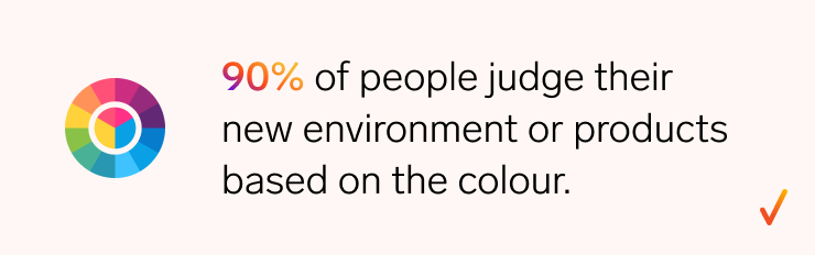
Source: Onexcell
Back in the 1990s and early 2000s, neon colours were everywhere, but they often made websites look unprofessional and unpleasant to navigate.
Recently, the trend has shifted towards monochrome colours that resonate with a brand’s identity.
Typography
Typography is the art of arranging text in a way that makes it not only legible but also visually appealing.
It involves selecting the right fonts, sizes, and spacing to create a balanced and harmonious look.
Typography is essential because it helps communicate your message clearly and effectively.
The right font can evoke emotions and set the tone for your brand, while the wrong one can drive visitors away.
Visual Hierarchy
Visual hierarchy is the arrangement of elements on a page to show their order of importance.
It helps guide visitors through the content, ensuring they see the most critical information first.
Bad visual hierarchy means you guide the visitors to the wrong path. In the end, you don’t get what you expect visitors to do as they get lost.
Navigation
Navigation is how visitors move around your website. It’s crucial for ensuring that users can easily find what they’re looking for.
There are several types of navigation, including:
- Top navigation: A bar across the top of the page, which is standard and expected by most visitors.
- Side navigation: A menu on the left or right side of the page, often used for secondary or supporting links.
- Hamburger menu: A compact, three-line icon that reveals a menu when clicked, commonly used on mobile sites.
If you’re looking to master the basics of web design, our web design guide covers everything you need to know to create user-friendly, effective websites
Rule #1: Prioritise User Experience (UX)
The concept of creating a user-friendly experience isn’t as new as you might think. In fact, it began back thousands of years.
But it was Walt Disney who is often recognised as the first true UX Designer. His vision for Disneyland wasn’t just about creating an amusement park—it was about crafting an experience that delighted visitors at every turn.
Disney’s approach was simple yet profound: “Resist the temptation to tell too much, to have too many objects; don’t force people to swallow more than they can digest, try to stimulate and provide guidance to those who want more.”
This philosophy is at the core of UX design today.

Key Components of UX
Prioritising User Experience (UX) in web design means putting your visitors at the heart of every decision you make.
Remember, websites that prioritise UX have 400% higher conversion rate. It’s not something you can ignore.
Here are the key components that make up a solid UX:
- Ease of navigation: Good navigation is the backbone of a positive user experience. Visitors should be able to find what they’re looking for quickly and easily.
- Intuitive design: It anticipates users’ needs and makes it easy for them to interact with your site effortlessly. This involves everything from the layout and buttons to the way information is organised.
- User-centric content: Present content with your audiences in mind. This means being clear, concise, and relevant. It also involves structuring content in a way that’s easy to digest, even for a six-grader
- Accessibility: A truly user-friendly site is accessible to everyone, including people with disabilities. People with visual, auditory, cognitive, or motor impairments must be able to browse your site without trouble.
- Page load speed: No one likes waiting for a slow website to load. In fact, studies show that if a page takes more than three seconds to load, 40% of the visitors will leave.
| 5 key component of User Experience | |
 Ease of navigation Ease of navigation |  Intuitive design Intuitive design |
 User-centric content User-centric content |  Accessibility Accessibility |
 Page load speed Page load speed | Get Use Friendly Website Now |
Thankfully, web design services offered by top agencies like Onexcell typically guarantee a great user experience above anything else.
Rule #2: Ensure Mobile Responsiveness
With 61.95% of website traffic now coming from smartphones and tablets, designing a site that works well on mobile devices is crucial for reaching and retaining your audience.

If your website doesn’t offer a smooth mobile experience, you risk losing more than half of your potential visitors.
Mobile Responsiveness Best Practices
To ensure your site is mobile-friendly, follow these web design best practices:
- Implement responsive design: Responsive design automatically adjusts the layout and content based on different screen sizes. This ensures a better user experience for visitors, no matter the device being used.
- Optimise for touch: On mobile devices, users navigate with their fingers, not a mouse. Make sure buttons are large enough to tap easily, and avoid placing clickable elements too close together to prevent accidental clicks.
- Make your site lightweight: Mobile users are often on the go and don’t have time to wait for slow pages to load. Optimise your images, use efficient coding, and leverage caching to ensure your site loads quickly on mobile devices.
- Simplify navigation: Mobile screens are smaller, so it’s essential to keep navigation simple and intuitive. Consider using a hamburger menu or dropdowns to conserve space and make it easy for users to find what they need.
- Focus on mobile-optimised content: Use larger fonts, shorter paragraphs, and avoid clutter to enhance readability
Sure, ensuring mobile responsiveness means higher web design cost. But, when you think of the long-term gain, it’s definitely worth your money.
Rule #3: Focus on SEO-Friendly Design
An SEO-friendly design ensures that your website not only looks great but also ranks well on search engines, making it easier for potential visitors to find you..
Here are what you need to pay attention for SEO-friendly site:
- Site structure: A well-organised structure helps search engines crawl and index your site faster. Using clear navigation and internal linking also make it easy for users and search engine bots to understand the hierarchy and flow of your content.
- Meta tags: Title tags and meta descriptions should be optimised with relevant keywords, as they directly impact how your site appears in search engine results. These tags are your first chance to attract clicks, so make them count.
- Website performance: Search engines like Google prioritise fast-loading sites because they enhance user experience. A slow site not only frustrates users but also hurts your SEO rankings.
- Content optimisation: Your content should be rich in keywords, yet natural and engaging for readers. Balancing keyword usage with high-quality, informative content is key to improving your SEO
Sure, ensuring mobile responsiveness means higher web design cost. But, when you think of the long-term gain, it’s definitely worth your money.
Rule #4: Optimise Navigation for User Flow
When visitors can easily find what they’re looking for, they’re more likely to stay on your site and explore further.
Good navigation creates a smooth user flow, guiding visitors naturally from one section to another.
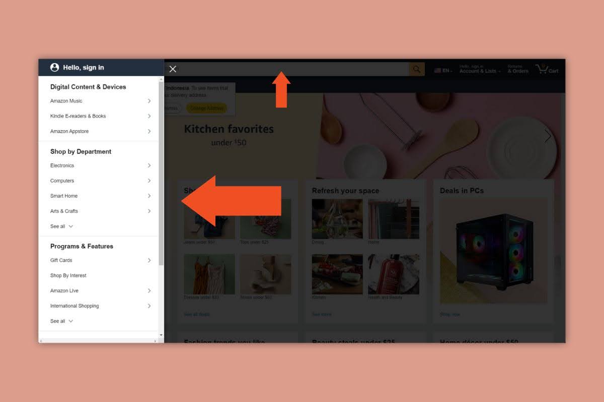
For instance, Amazon has a clear navigation system despite the amount of products they have.
To optimise your site’s navigation, you can follow these best practices:
- Be clear and straightforward with your menu structure: Categorise logically that makes sense to your visitors. Avoid clutter—keep it simple so users can quickly locate the information they need.
- Take your internal linking seriously: It helps users discover more content and improves SEO by spreading link equity. Use clear, descriptive anchor text so visitors know exactly where each link will take them.
- Utilise search functionality: A well-designed search bar allows users to quickly find specific content without digging through menus. Make sure your search function is visible and delivers accurate, relevant results.
Rule #5: Use Visual Hierarchy to Guide Users
A clear visual hierarchy not only improves aesthetics but also makes it easier for users to navigate your site and understand your message. They will get their priority right based on what you show them.
To create a clear visual hierarchy, consider these tips.
- Use contrasting colours to highlight key elements. For instance, a vibrant colour for your Call-to-Action (CTA) button makes it stand out against a more neutral background.
- Draw more attention with larger elements: Use larger fonts for headings or important messages to ensure they catch the user’s eye first.
- Priorities the most important information on the most visible place: For example, place your CTA near the centre or bottom of the screen, where users’ eyes often linger, especially on mobile devices.
Take Netflix’s website as a reference. It’s an example of the best website design based on visual hierarchy.
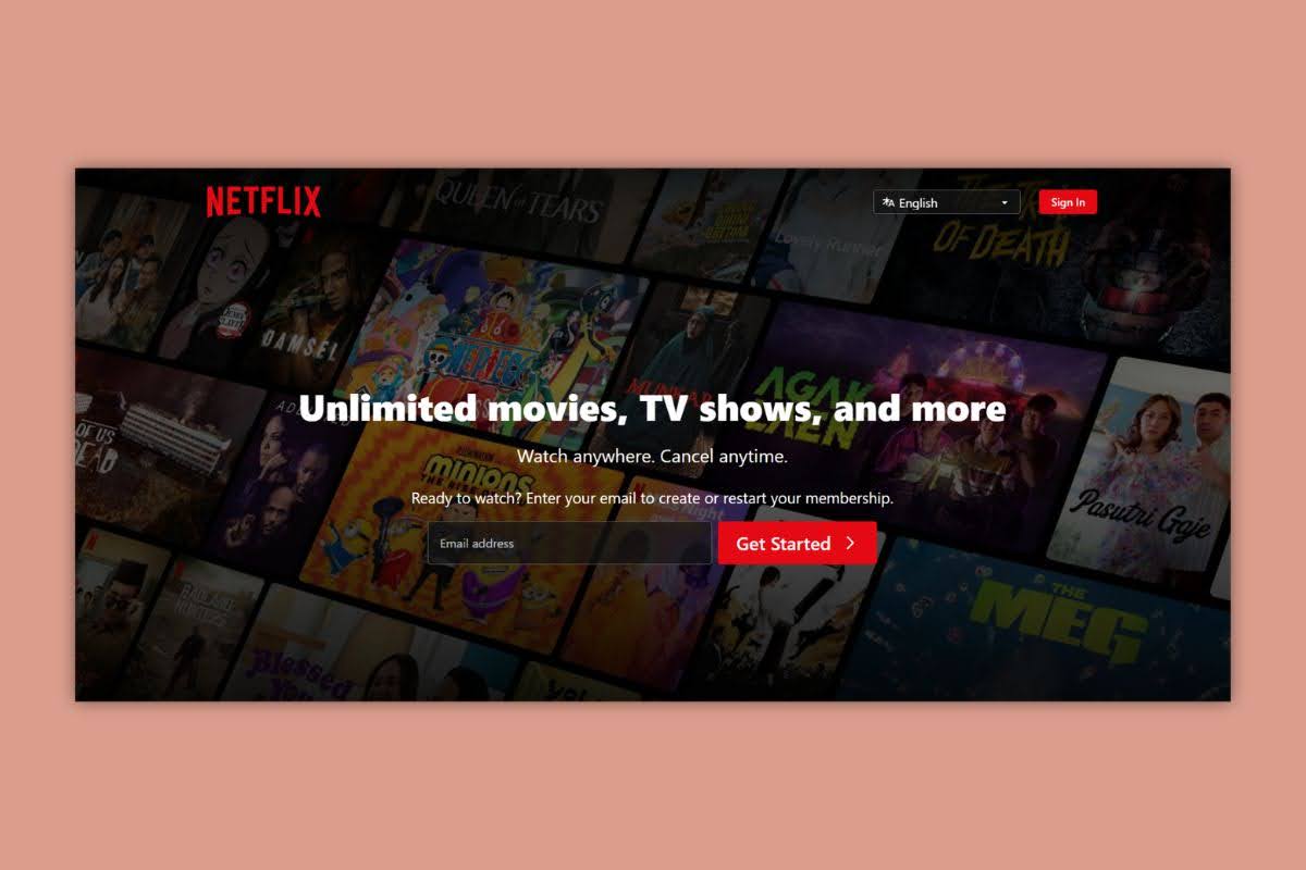
The phrase “Unlimited movies, TV shows, and more” uses the largest and boldest font, immediately drawing attention.
Furthermore, the CTA button uses a vibrant red colour, placed prominently at the bottom of the screen.
This way, users can easily locate and click the button, even on mobile devices.
Rule #6: Maintain Consistent Branding
Branding is the identity of your business—it’s how your customers recognise and remember you.
Consistent branding means using the same colours, fonts, logos, and messaging across all platforms, including your website.
This consistency builds trust and reinforces your brand’s image in the minds of your visitors.
When your website reflects your brand consistently, it creates a cohesive experience that strengthens your brand’s identity and helps differentiate you from competitors.
Abandoning consistency is one of the mistakes to avoid when designing a website.
Here’s why:
- Confusio: Inconsistent elements like fonts, colours, or layouts create confusion and disrupt the user’s flow.
- Lack of trustworthiness: A website with inconsistent design can appear unprofessional and unreliable.
- Difficulty in navigation: Users rely on visual cues to find their way around a website, and inconsistency makes this difficult. A frustrating user experience can lead to higher bounce rates and lower conversions.
Rule #7: Incorporate Effective Calls-to-Action (CTAs)
A Call-to-Action (CTA) is a prompt that encourages visitors to take a specific action.
The goal of a CTA is to guide users towards a conversion, whether that’s making a purchase, subscribing to a newsletter, or downloading a resource.
Here are some tips for effective CTAs:
- Be unique: Avoid generic phrases. Tailor your CTAs to your brand and the specific action you want users to take.
- Use action-oriented language :Phrases like “Get Started” or “Join Now” encourage immediate action. Even better, include a timer to create urgency.
- Position strategically: Place CTAs where they are easily visible and naturally follow the user’s journey on your site.
A great example of a unique and clear CTA is from Oncexcell’s “READY TO CONNECT WITH ONEXCELL” button is a standout CTA. and immediately grabs attention.
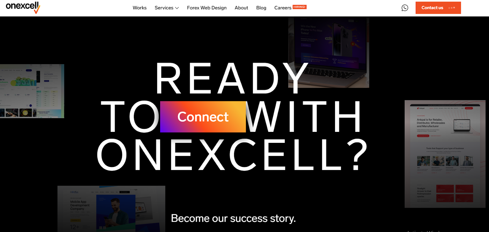
It appeals to the universal love of free offers, making it easy for users to fill in their email and sign up for a membership.
This kind of compelling CTA not only catches the eye but also effectively drives conversions.
Conclusion
Designing a website involves balancing various elements, from user experience and SEO to consistent branding and effective CTAs.
While there’s a lot to learn, following these rules will help you create a site that’s both visually appealing and functional.
However, if you find the process overwhelming, it’s best to discuss your goals with a reliable web design agency like Onexcell.
With over a decade of experience, we have the expertise to bring your vision to life and ensure your website meets all the essential criteria for success.