Will you trust, let alone buy from an outdated looking website? Most likely not. And users are probably thinking the same thing.
If you want users to take notice of your site, trust your brand, and eventually, buy your products or services, there’s only one way to Rome: keeping updated with the latest web design trends.
Let’s dive into some top trends shaping web design in 2026 and beyond.
6 Innovative Web Design Trends to Inspire You in 2026
From e-commerce to SaaS, portfolios to blogs, these trends can be tailored to fit any business.
The following sections will explore each trend in detail, complete with practical examples and expert insights to inspire your own web design journey.
1. Minimalistic Yet Bold Aesthetics
Minimalism in web design has evolved beyond mere simplicity. Today, many sites include bold elements such as oversized typography and vibrant colours.
This approach, known as “bold minimalism,” marries clean space with striking design features to create visually engaging websites.
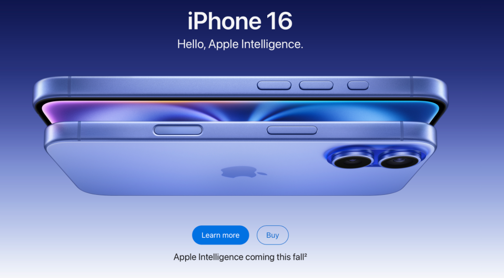
Apple is one great example. When you visit its website, you will see large fonts and a subtle colour palette that draws attention to products without overwhelming viewers.
Experts emphasise the strategic use of minimalism. Eric Coutet, Product Design Director at Lizard Global, points out that minimalist design isn’t just about aesthetics—it’s about making purposeful choices that enhance usability and reduce distractions.
He notes, “Minimalist design requires thoughtful choices, focusing on essential elements while creating ample white space.”
Similarly, Christopher Nguyen from UX Playbook believes that 2026’s minimalism is about “stripping away the unnecessary and focusing on what truly matters,” enhancing both efficiency and enjoyment in digital experiences.
The performance benefits of minimalist design are significant, especially in terms of loading speeds. Reducing heavy graphics and scripts can dramatically decrease page load times, thereby improving user engagement.
Research indicates that even a one-second delay in load time can cause a 7% drop in conversions. Moreover, fast-loading minimalist sites also perform better in SEO rankings.
Adding interactive elements like micro-animations and dynamic buttons shows that minimalist design can remain playful and functional. For instance, Dragonfruit Media and Studio Yoke incorporate these features to engage users without cluttering the design.
In summary, modern minimalism in web design is not just about aesthetic simplification but also about creating seamless user experiences that blend functionality with innovative design.
This strategy boosts usability, page load times, and SEO benefits. It proves especially effective in maintaining user interest and fostering interactions on digital platforms.
2. 3D Elements and Immersive Experiences
As technology evolves, the use of augmented reality (AR) and virtual reality (VR) provide endless opportunities for designers to create compelling, interactive experiences that attract and retain users.
IKEA’s AR is a prime example. This feature allows customers to visualise products in their own space, which greatly increases their confidence when making a purchase.
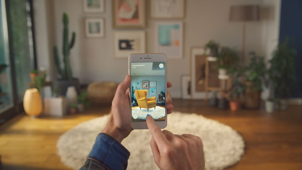
In fact, a study shows that 3D visuals can increase purchase intent by nearly 30% and enhance product understanding by 23%, helping reduce returns and improve customer satisfaction.
Additionally, interactive 3D features can extend user engagement on pages, potentially increasing the time spent by 15 to 40 seconds, leading to higher conversion rates.
Clarke Noone, a creative director, said that immersive 3D experiences are effective even on smaller screens. This approach is exemplified by mobile apps like Pokémon GO, which use intuitive interactive design to captivate users.
Moreover, companies like Savic Motorcycles and Chirpley are leveraging 3D visuals to strengthen their digital presence.
Savic Motorcycles allows an immersive exploration of its products, aligning with the brand’s futuristic appeal, while Chirpley uses playful 3D animations to make technical content more engaging and relatable.
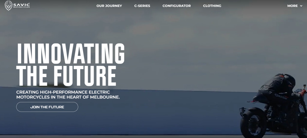
In the end, using 3D elements in web design not only enriches the visual experience, but can also improve user engagement.
3. AI-Generated Content and Personalization
AI-powered technology and personalization improve web experiences by offering tailored interactions and dynamic content that adjusts to how users behave.
AI looks at user data, like browsing history and purchase behaviour, to create personalised experiences that enhance user engagement and satisfaction.
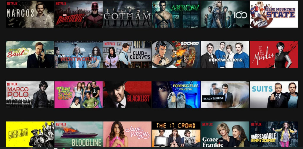
To illustrate, Amazon uses AI to analyse what customers buy and then recommends similar items, encouraging more sales. In the same way, Netflix tailors its show and movie suggestions to match viewers.
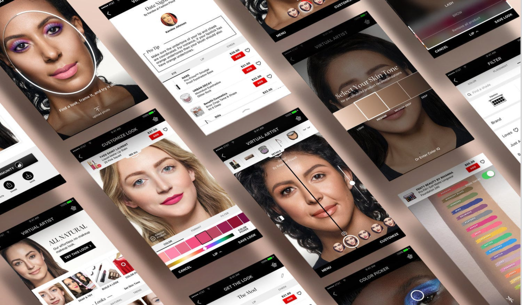
In the e-commerce space, Sephora’s Virtual Artist app, which uses AI and augmented reality, allows users to try on makeup virtually.
This will undoubtedly make shopping easier than ever, increasing the likelihood of a purchase.
Several studies also support the power of AI in personalization. According to McKinsey, brands that excel at personalization generate 40% more revenue, while 80% of consumers are more likely to purchase from brands offering tailored experiences.
Furthermore, 60% of consumers are more likely to become repeat buyers after a personalised shopping experience. Over 90% of marketers also report improved profitability from implementing AI-based personalization strategies.
Dave Anderson, VP of Product Marketing and Strategy at Contentsquare, provides insight into the future of AI in web design:
“The impact that generative AI will have on the overall customer experience will be seen not just in personalization but also in the speed and scaling of content creation.” Anderson highlights that while AI offers tremendous opportunities, challenges exist.
He warns that “Tech leaders will need to start taking regulations more seriously, with ethics playing a big role in AI, just as it did with data privacy discussions a decade ago.”
This underscores the need for balance as brands leverage AI to personalise experiences while ensuring ethical oversight.
4. Nostalgic and Retro Design
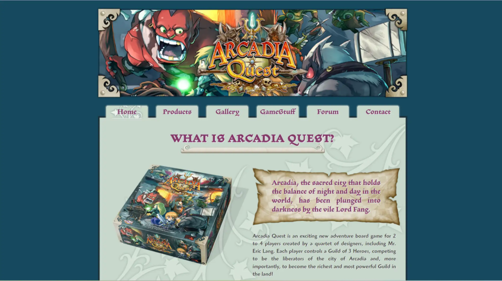
Nostalgia in web design is making a strong comeback, blending old-school aesthetics with modern functionality. This trend draws users in by evoking familiar visuals, sounds, and feelings from the past while providing a seamless, modern experience.A great example is ArcadiaQuest, which channels 80s arcade game vibes with pixelated graphics and bright, neon colours. Its interactive design engages users with a playful retro theme, all while ensuring ease of navigation.
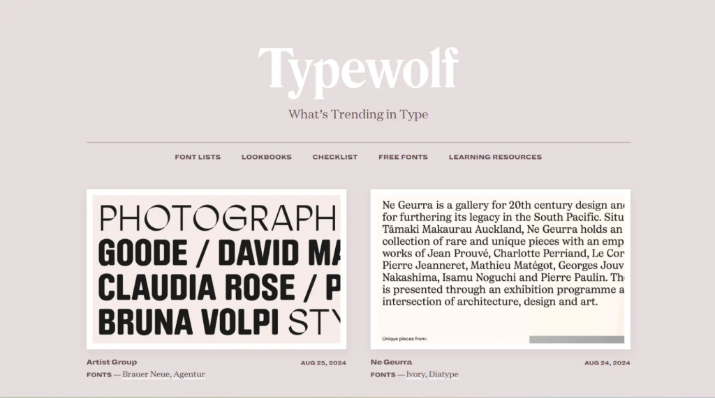
Similarly, Typewolf taps into the retro design by using soft typography and muted colour palettes reminiscent of vintage magazine styles. These elements appeal to both older users, who find comfort in the familiarity of these designs, and younger users, who see retro elements as novel and exciting.
Another standout example is Vacation sunscreen, which combines retro packaging with a scent that evokes beach vacations from the 80s, enhanced by a digital playlist for a full sensory experience.
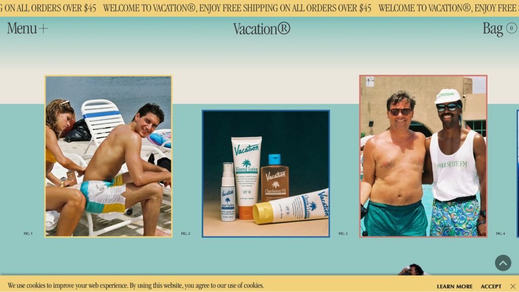
This blend of nostalgic elements with modern design creates a broad, cross-generational appeal. Older users connect emotionally with the memories these designs invoke, while younger audiences are drawn to the novelty and charm of retro aesthetics.
By combining retro-inspired visuals like vintage fonts, bold colour schemes, and sensory elements with modern web functionality, brands can stand out in a landscape dominated by sleek, minimalist designs.
5. Micro Interactions and Mini Animations
Micro interactions and mini animations greatly enhance user experiences on websites by providing instant feedback and subtly guiding actions.
Interactive design elements, such as hover effects and loading animations, keep users engaged without overwhelming them.
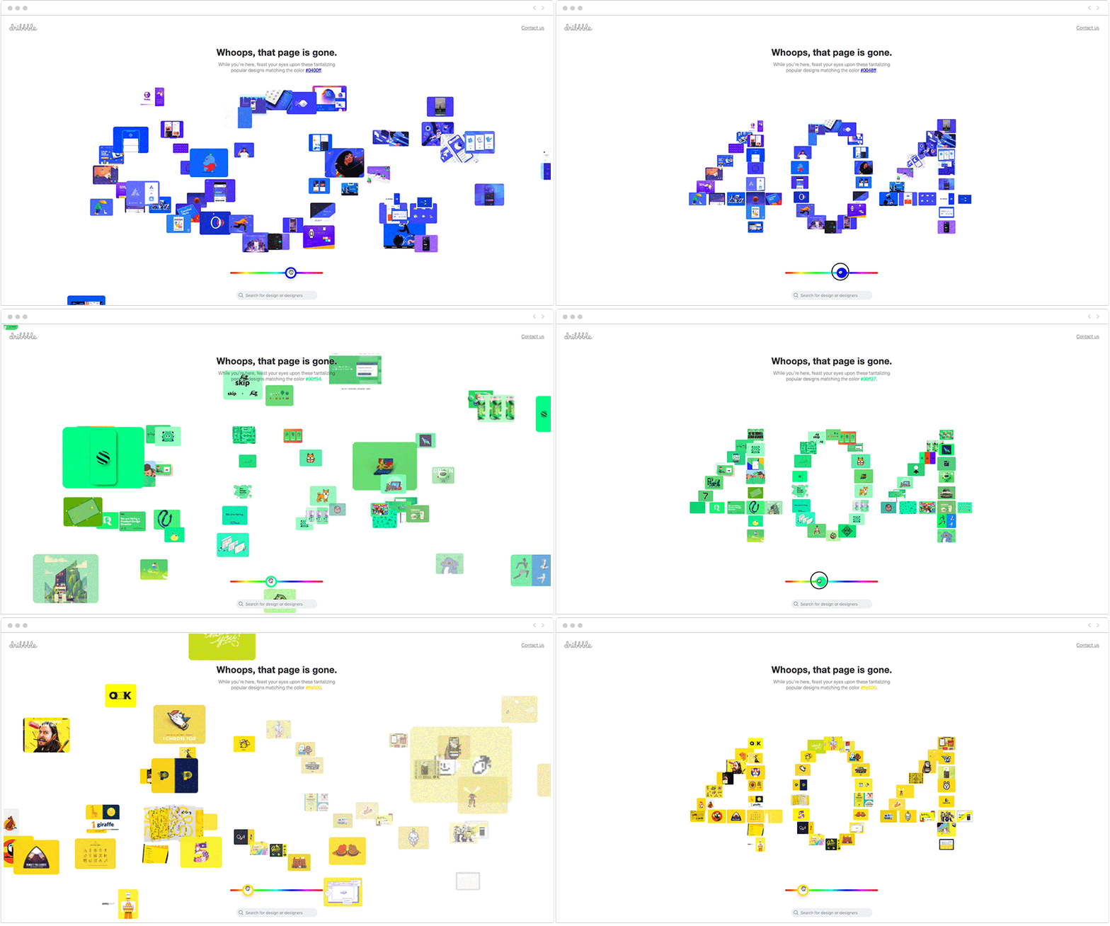
Patricia Begley-Nelson, Principal of Product Design at Lantern Studios, emphasises their importance:
“Micro interactions add an element of delight to the user experience, making interactions more engaging. Playful animations or interactive loading screens can make waiting periods more enjoyable, encouraging users to stay engaged with the product.”
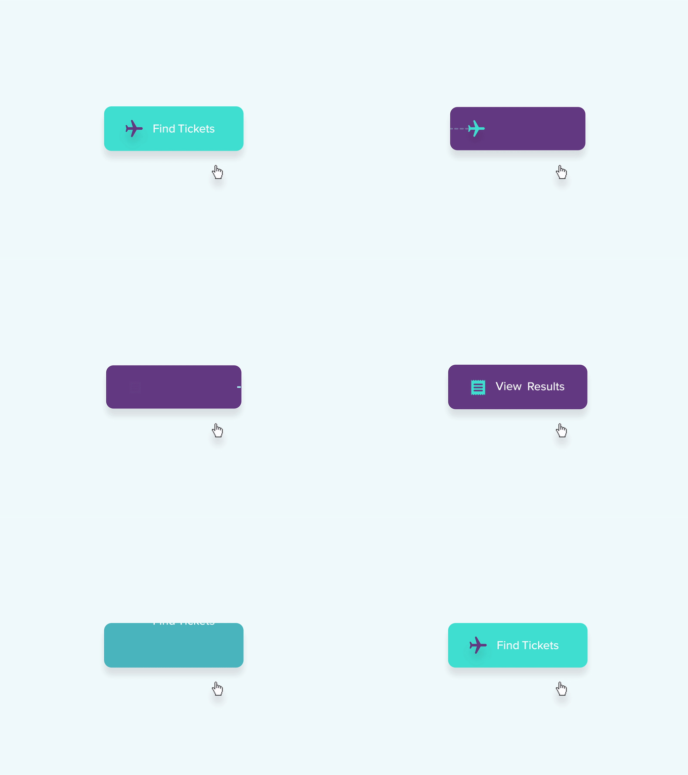
In tools like Slack and Google Assistant, micro-interactions provide crucial feedback, such as indicating when messages are sent or received. Mailchimp, for instance, uses celebratory animations after users complete tasks like scheduling newsletters, enhancing the sense of accomplishment and promoting further interaction.
Effectively integrated micro-interactions not only beautify a website but also improve its functionality. They should be subtle, purposeful, and non-intrusive, guiding the user journey gently and enhancing the overall experience without becoming distractions.
6. Dark Mode and Dimensionality
Dark mode has become a key feature in modern web design. It offers both aesthetic appeal and functional benefits like reducing eye strain and enhancing device energy efficiency.
Platforms like Slack and YouTube use dark mode to provide a more comfortable browsing experience, especially in low-light settings. Paired with vibrant contrasting colours and a clear visual hierarchy, it ensures readability while enhancing user engagement.
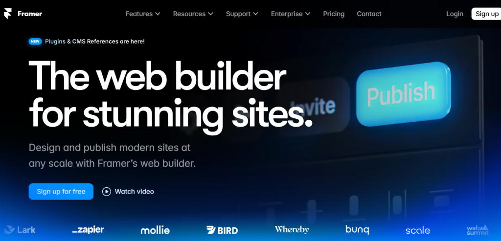
An exciting example of dark mode with dimensionality is Framer. This platform uses dark mode along with fluid animations and dimensional effects to provide a sleek, interactive design experience.
The dark background allows the vivid design elements and real-time product demonstrations to stand out, making it a visually engaging space for users.
The popularity of dark mode is driven by its practical advantages. Studies show that 81.9% of Android users prefer dark mode for its ergonomic benefits, particularly in reducing eye strain.
Additionally, dark mode extends battery life on OLED screens by up to 60%, making it a valuable feature for device performance.
Sanjivani Thorat, Lead Product Designer at Reckonsys, explains, “Dark mode design isn’t just about aesthetics; it’s about creating a visually comfortable, accessible, and functional user experience.”
Thorat believes in the importance of balancing darker tones with vibrant colours to maintain readability, while the added depth in design ensures smooth navigation and a better user experience.
Final Thoughts
Staying updated with modern web design trends is crucial to building a website that looks modern. These trends, while innovative, should always be balanced with usability to ensure a seamless and accessible user experience.
It’s important to remember that the goal is not just to follow flashy trends but to blend creativity with functionality, reinforcing your brand’s identity.
Don’t be afraid to experiment; tailor these trends to suit your brand and audience. Whether incorporating 3D elements, implementing dark mode, or using micro-interactions, the key is finding what resonates most with your users.
If you’re not sure where to begin, our design experts here at Onexcell are ready to help. Get in touch and let’s build a modern-looking, user-friendly website together.
