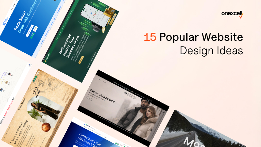
In 2026, website design is no longer just about aesthetics; it’s a critical factor that affects user trust, engagement, search rankings, and conversions. It is used in a digital-first world to judge a brand within seconds of landing on a site.
The 15 popular website design ideas include minimalist layouts and dark mode to micro-interactions, AI personalization, and sticky CTAs. Each design provides a practical decision framework to help guide your design direction for your needs.
Whether you’re redesigning a brand site, building a new landing page, or refreshing your eCommerce store, this article helps you navigate the latest design trends with purpose and strategy.
Why Website Design Matters In 2026?
Website design matters in 2026 because of user perception, trust, and digital performance. It is the first impression that can make or break your online presence. Your website is your digital storefront, and just like a messy, confusing physical store turns customers away, a poorly designed site sends visitors packing in seconds.
In fact, studies show that users form an opinion about your website within 0.05 seconds, and if it’s slow or cluttered, over 38% will bounce immediately. But it’s not just about looks; design directly affects SEO, bounce rate, usability, and conversions.
In 2026, user expectations have evolved: people expect mobile-first design, instant loading, clean UX, and increasingly, AI-personalized experiences. Google’s Core Web Vitals now reward fast, stable, responsive websites, meaning that aesthetic and performance are inseparable in your digital strategy.
Whether you’re building a portfolio, a SaaS platform, or an online store, great design is no longer a luxury; it’s a competitive necessity.
How To Use These Website Design Ideas Effectively
To use the website design ideas effectively, you need to align them with your brand’s identity, understand your users’ expectations, and match the design to your website’s core purpose. It does not matter if it’s a portfolio, blog, SaaS platform, or online store.
A creative layout that works for a photography portfolio might hurt usability on a financial services site. Instead of copying trends blindly, adapt them to serve a function first. Use contrast to guide attention, hierarchy to organize content, white space to reduce visual noise, and always ensure your web design is responsive across all devices.
Great design isn’t just about looking modern—it’s about making sure every element serves a purpose. Keep performance in mind too: animations, video backgrounds, or custom fonts can drag site speed if poorly implemented.
Before choosing any idea, ask yourself, Will this improve clarity, engagement, or action for my users?
15 Most Popular Website Design Ideas Right Now
The most popular website design ideas right now include minimalist layouts with bold typography, dark mode themes, scroll-triggered animations, AI-personalized content blocks, and video backgrounds. These trends combine aesthetics with functionality, helping websites feel modern while improving user experience and engagement.
The 15 most popular website design ideas are explained below:
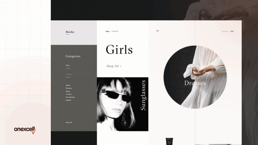
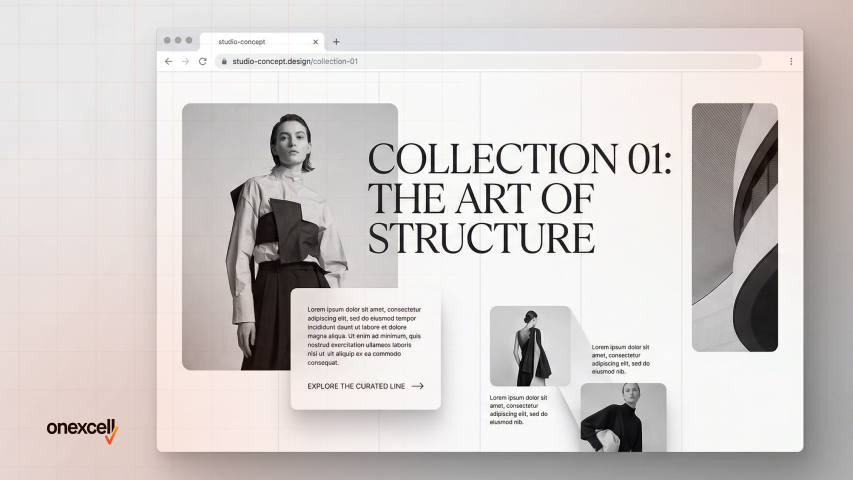
Minimalist Design With Bold Typography
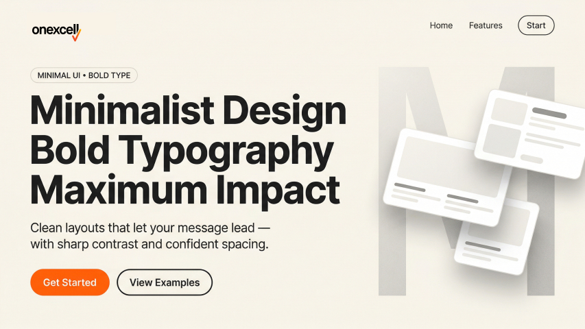
Minimalist design with bold typography strips away clutter and focuses on clean layouts, generous whitespace, and powerful headlines that grab attention. This style emphasizes clarity over complexity, making it easier for users to engage without visual overload.
Its popularity stems from the rising demand for fast-loading, mobile-friendly websites and the influence of modern branding aesthetics. With users scanning rather than reading, bold typography becomes the focal point—driving the message home instantly.
This design works exceptionally well for portfolio websites, personal brands, SaaS landing pages, and agency sites where messaging clarity is critical. It’s also great for brands that want to communicate elegance, focus, or authority.
To implement it effectively, use tools like Figma or Framer to plan visual hierarchy. Pair large, custom fonts with a muted or monochrome palette. Use CSS Flexbox or Grid for clean spacing, and avoid unnecessary animations or media that can distract from the headline. Consistency in font weight, spacing, and alignment is key.
Dark Mode Aesthetics
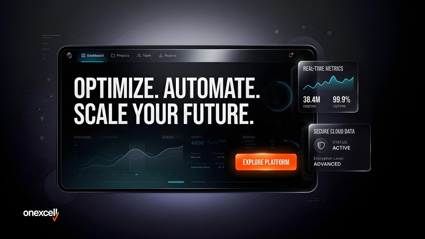
Dark mode aesthetics use dark color schemes, usually black or deep gray, as the dominant background with light-colored text and accents. It creates a modern, sleek look that reduces eye strain, especially in low-light environments.
It’s popular due to growing user preference for night-friendly interfaces and the native dark mode settings in operating systems and apps. Tech-savvy users and younger demographics tend to favor this style, and many popular platforms (like YouTube, Twitter, and macOS apps) offer it by default.
Dark mode works well for portfolio websites, fintech apps, software tools, and entertainment platforms where mood and visual edge matter.
For implementation, designers can use tools like Figma or Adobe XD to create dual-mode UIs (light and dark). On the web, CSS media queries like @media (prefers-color-scheme: dark) enable automatic switching based on user preferences. Ensure high contrast, accessible typography, and proper logo adaptations when using dark backgrounds.
Micro-Interactions And Hover Effects
Micro-interactions are subtle animations or changes that occur when users interact with an element, like a button enlarging on hover or a heart filling up when clicked. These effects make the user interface feel more responsive and alive without overwhelming users.
They are trending because they enhance feedback and emotional engagement, especially on e-commerce and SaaS platforms. Users feel guided and reassured when small interactions acknowledge their actions.
You’ll find micro-interactions useful on buttons, forms, product previews, and navigation menus, especially for SaaS dashboards, landing pages, and modern brand sites.
Tools like Framer, GSAP (GreenSock Animation Platform), and Lottie make implementation smoother. Use them sparingly—only where they improve usability or delight. Ensure that animations are fast, lightweight, and don’t interfere with accessibility or performance.
Full-Screen Hero Sections
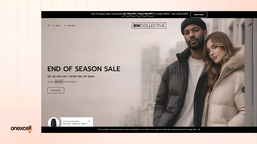
A full-screen hero section takes up the entire viewport on load, often with a bold headline, strong image or video, and a clear CTA. It sets the tone for the rest of the site and captures attention instantly.
This design is popular because it offers a clean, focused introduction, reducing distractions and improving engagement. Many brands use this to tell their story or deliver a high-impact offer upfront. It is great for agency websites, product launches, personal portfolios, and high-conversion landing pages.
Designers typically use Figma or Webflow to mock up full-screen sections with fluid typography and visual balance. Use background videos carefully (compressed and silent), and always keep the CTA above the fold. CSS Flexbox or Grid helps achieve full-screen height across devices.
Brutalist Or Anti-Design Layouts
Brutalism in web design embraces a raw, unconventional aesthetic—think clashing fonts, minimal styling, and asymmetry. It intentionally breaks typical design rules to create a jarring, memorable experience.
It’s popular with creatives and rebellious brands who want to stand out in a sea of clean, polished websites. It communicates authenticity, edge, and individuality. Ii its ideal for music artists, fashion brands, experimental portfolios, or Gen Z-focused blogs.
Designers often mock up brutalist layouts in Figma or Adobe XD with minimal grids and intentionally “broken” visual flows. HTML and CSS do the heavy lifting, just avoid accessibility pitfalls like illegible fonts or confusing navigation. Use this style with intention, not randomly.
Split Screen Layouts
Split-screen design divides the screen into two or more panels, often to compare two concepts, highlight dual CTAs, or balance text and visuals. It brings symmetry and clarity to the layout while offering visual interest.
It’s trending due to its versatility across screen sizes and its ability to present multiple messages without clutter. Responsive design tools and flexible grids make this easier than ever. You’ll see this used in product vs service comparisons, signup/login pages, and portfolio showcases.
To implement, tools like Elementor and Webflow allow drag-and-drop creation of split sections. For custom code, CSS Grid or Flexbox works best. Always test mobile responsiveness and ensure the split doesn’t create confusion or cognitive overload.
Scroll-Triggered Animations
Scroll-triggered animations bring elements to life as users move down the page—text fades in, images slide up, or sections animate into view. It creates a dynamic and engaging browsing experience that feels guided and interactive.
This trend is rising because it increases time-on-page and encourages exploration, especially for storytelling-style sites. It also helps break long pages into digestible moments. It is best suited for brand storytelling pages, agency portfolios, product showcases, and educational websites.
Tools like ScrollTrigger (from GSAP), Lottie, or AOS.js allow smooth and performance-optimized scroll animations. Always keep animations subtle and performance-friendly
Gradient Backgrounds And Duotone Effects
Gradients blend multiple colors to create depth, dimension, or mood across backgrounds and sections. Duotone applies two-tone overlays to images, creating a pop-art or stylized effect.
They’ve come back in style due to tools like Figma and CSS enhancements, plus their ability to inject personality and vibrancy without loading large assets. Gradient background is best used in SaaS hero sections, landing pages, mobile app promos, and lifestyle brand websites.
Use linear or radial gradients with modern CSS, like background-image: linear-gradient(), for performance. Tools like Coolors or UIGradients help pick trendy palettes. When using duotone, Adobe Photoshop or CSS filters can apply the effect, but test legibility with text overlays.
Hand-Drawn Or Illustrated Elements
This design style includes custom doodles, character illustrations, or sketched icons to give a warm, personal, or quirky vibe. It breaks away from generic stock visuals and adds brand charm.
It’s gaining popularity because brands want to appear more human, relatable, and creative—especially in a world full of polished, templated designs. Illustrated elements are perfect for education websites, children’s products, lifestyle blogs, or personal brand sites.
Designers often draw in Procreate, Illustrator, or even pen-to-paper, then digitize. Use SVGs for lightweight, scalable results. Balance with whitespace and avoid overdoing it—illustrations should support the content, not overwhelm it.
Asymmetrical Grid Layouts
Asymmetrical grids break the traditional left-right balance by placing content off-center or overlapping, creating dynamic visual flow. It grabs attention and guides the eyes through a unique reading path.
This style is popular because it defies predictability and brings sophistication, especially in editorial and fashion designs. It challenges users just enough to feel artistic, not chaotic.
Asymmetrical grid layouts is ideal for high-end fashion, creative studios, or storytelling blogs. You can use CSS Grid or Flexbox to build irregular patterns.
Figma also allows dragging elements freely for planning. Keep mobile layouts clean—what’s beautiful on desktop can break usability on smaller screens.
Glassmorphism Or Frosted Glass Effects
Glassmorphism creates a frosted-glass illusion with blurred backgrounds, transparency, and subtle shadows. It mimics translucent surfaces like glass panels over colorful or layered content.
Popularized by iOS/macOS design systems, it feels modern, minimal, and light—especially when paired with soft gradients or neon tints. You see glassmorphim is seen in finance dashboards, crypto sites, app landing pages, or design portfolio UIs.
Use CSS backdrop-filter: blur() for the glass effect. Design tools like Figma or Framer preview this look well. Ensure text over glass remains legible and accessible, especially for users with vision impairments.
Ai‑generated Or Personalized Content Blocks
These sections dynamically adjust based on user behavior, like showing different CTAs, product recommendations, or headlines depending on who’s visiting. AI tools now generate real-time content layouts tailored to user segments.
As personalization becomes key to engagement, this trend is rising across e-commerce, SaaS, and learning platforms. It improves retention and conversion by making users feel understood. AI-generated content blocks are great for SaaS onboarding pages, eLearning portals, and product recommendation engines.
Use tools like Mutiny, Segment, or even custom JS integrations with OpenAI or Google Optimize. Keep fallback content ready. Test personalization logic frequently and stay compliant with GDPR/CCPA if you’re tracking behavior.
Need to ask Something else?
Use the form here to send us your question. We’ll reply within one business day.
Sticky Navigation And Floating CTAs
Sticky headers or floating call-to-action buttons stay visible as users scroll. This ensures important navigation or action prompts (like “Buy Now” or “Chat”) are always within reach.
They’re popular because they boost conversions and minimize bounce—especially on long or scroll-heavy pages. Best used on eCommerce sites, blogs, long-form sales pages, and lead-gen funnels.
Use CSS position: sticky or JavaScript for dynamic behaviors. Tools like Elementor and Webflow support floating widgets natively. Make sure they’re not intrusive—keep size small, and allow close/dismiss functions if needed.
Video Backgrounds Or Loops
A short, muted video plays in the background of a section (usually the hero), adding visual motion and storytelling without interaction. It immediately grabs attention and can communicate mood or product usage in seconds.
Video backgrounds is still trending in 2026 due to better web performance tools, faster connections, and content-first brand strategies. It is ideal for luxury goods, SaaS walkthroughs, events, or real estate listings.
Compress videos using HandBrake or export via Premiere Pro/After Effects. Use autoplay, muted, and loop attributes for background HTML5 video. Avoid mobile autoplay for performance—fallback to a static image.
Interactive Product Tours Or Demos
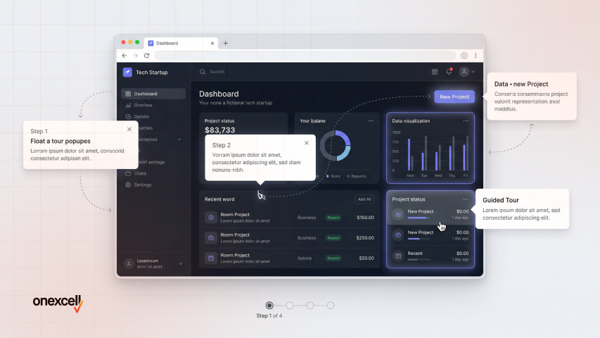
This idea involves guiding users through a product’s features via step-by-step tooltips, embedded walkthroughs, or interactive demos. It lets users experience the value before signing up.
Widely used in SaaS onboarding and conversion optimization, this approach boosts product understanding and reduces churn. Perfect for software landing pages, app tutorials, and tools with complex dashboards.
Tools like Intro.js, Userpilot, or custom JavaScript power these tours. Always offer a “skip tour” option and track completion analytics. Keep each step short and focused—no one likes a long lecture.
How To Choose The Right Website Design Idea
To choose the right website design idea, clarify your brand identity, understand your audience’s preferences, and match the design to your website’s purpose. Always prioritize clarity and usability, choose a web development design that supports your content, drives conversions, and feels natural to navigate for your specific visitors.
To choose the right website design idea, follow this practical framework:
- Define your brand tone: Is your brand serious, formal, playful, or experimental? A law firm might benefit from a minimalist layout, while a design agency can explore asymmetry or hand-drawn elements.
- Understand your target user behavior: Do users browse quickly or read deeply? For quick actions, use bold CTAs and sticky navs; for deeper engagement, consider interactive demos or personalized blocks.
- Assess your primary content type: Is your site heavy on images, text, videos, or data? Video backgrounds suit creative portfolios, while structured grids support educational content.
- Use this mini decision matrix:
- Do you sell a tech product? Try minimalism with micro-interactions.
- Are you a creative brand? Go bold with illustrations or asymmetry.
- Do you target mobile-first users? Prioritize responsive, fast-loading design.
- Is SEO important? Choose layouts with clear hierarchy and lightweight performance.
- Consider trade-offs: Fancy effects may slow down your site. Brutalist layouts may confuse conservative users. Balance creativity with performance and clarity.
- Test before committing: Use A/B testing or real user feedback to validate your design choices before a full rollout.
What Makes A Website Design Truly Effective In 2026?
Clarity, usability, and performance make a website design truly effective in 2026. A design isn’t just about how it looks; it’s about how well it guides users to take action.
When a website loads fast, works smoothly across devices, and clearly communicates value, users stay longer and engage more. Add intuitive navigation, strong visual hierarchy, and accessible layouts, and you’re not just impressing users, you’re also aligning with Google’s Core Web Vitals and UX signals that impact SEO.
The most effective websites in 2026 don’t just look good; they feel effortless to use and adapt to real user behavior.
What Are The Things To Consider When Choosing A Website Development?
When choosing website development, consider your goals, content type, desired features, scalability, and budget. The tech stack and CMS you choose should support your future growth and not just your current needs.
Whether you’re building an eCommerce site, a portfolio, or a SaaS platform, the development process must align with your content structure, integrations (e.g., CRM, payment gateways), SEO, and loading speed. Choose flexible frameworks that allow design ideas to come alive efficiently.
Should I Follow Design Trends For My Brand?
Yes, you should follow design trends for your brand. However, follow only if the trend supports your brand’s message and user goals. Don’t copy trends blindly, adapt them meaningfully.
Trends like dark mode or animations can enhance UX when used with intention. But forcing them without purpose can hurt usability or load time. Your brand voice, audience, and conversion goals should guide every design choice.
How Do I Choose the Right Design Idea for My Industry or Audience?
You choose the right design idea for your industry or audience by aligning with your industry norms, audience expectations, and your product’s personality. Study competitor sites and user feedback for cues. For instance, tech audiences may expect clean, fast, and minimal layouts, while artists or fashion brands can afford to go bold or experimental.
Understanding what visually connects with your market helps you choose with confidence.
Can I Combine Multiple Design Ideas On One Website?
Yes, you can combine multiple design ideas as long as they complement each other and don’t create visual chaos. Consistency is more important than sticking to one idea.
For example, you can use a full-screen hero section with scroll-triggered animations and still apply minimalist typography throughout. Just make sure transitions feel natural and don’t overwhelm your user’s journey.
How Do I Test If My Website Design Is Working Or Needs Improvement?
You can test your website design by tracking metrics like bounce rate, session duration, and conversion rate, and by running A/B tests on key sections. Real user feedback is also a powerful tool.
Tools like Hotjar, Google Analytics, or even simple surveys can reveal friction points in your design. Iterate based on behavior, not just personal preference—design is never a one-time project.