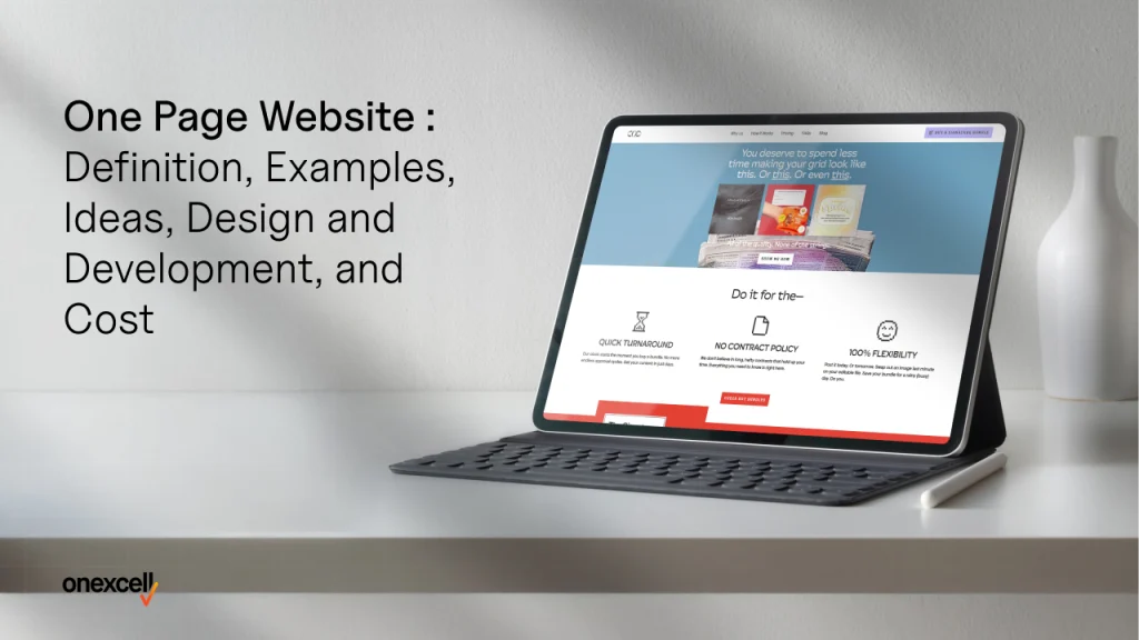
A one-page website is a single web page where everything is within reach. Instead of clicking through different pages, you simply scroll down to find all the important details in one place. This approach makes it an ideal choice for businesses or individuals who want to present information concisely.
One-page website’s characteristics are their simplicity, fast navigation, and engaging designs. They often include sections like About, Services, Testimonials, and Contact on one continuous page, making them user-friendly and visually appealing.
A multi-page website is like a building with multiple rooms, where each page has specific information. Users navigate through different pages, such as Home, About, Services, and Contact, to find what they need.
One-page websites offer a clean, distraction-free user experience, making them perfect for focused storytelling.
Creative ideas like parallax scrolling, interactive animations, and dynamic content sections makes a one-page website stand out. These elements enhance engagement and add a professional, polished touch.
Minimalist designs with clean layouts and clear typography are key to one-page websites. Responsiveness is equally crucial, ensuring the website looks great and functions well on all devices, including smartphones and tablets.
A study by Google, titled Less is More: A Lesson by Google on How Simple Web Design Wins Over Visitors in Seconds, reveals that users form first impressions of a website in just 50 milliseconds. The study shows that simpler website designs improve user engagement and satisfaction, as they enhance focus and usability. A well-designed one-page website naturally benefits from this, offering a clean, distraction-free layout that ensures a seamless experience.
The cost of developing a one-page website ranges from £240 to £2400, depending on the design complexity and the developer’s expertise, making it a more affordable option than multi-page websites.
A well-optimized one-page website typically loads within 1-3 seconds, ensuring a smooth user experience. With fewer resources to load, these websites are faster and more efficient. Additionally, when structured with the right keywords and clean navigation, they can perform well in search engine rankings.
What is a One-Page Website?
A one-page website is a type of web design where all the content is presented on a single webpage, often referred to as a single-page site or single HTML page, unlike traditional multi-page designs, which spread content across several interconnected pages.
A one-page website focuses on simplicity and efficiency. It eliminates the need for users to click through multiple pages, allowing them to access all information through seamless scrolling or section-based navigation. In contrast, multi-page websites are structured for more extensive content, catering to businesses that need categories, blogs, or e-commerce functionality.
According to a study by Adobe titled 5 Consumer Trends That Are Shaping Digital Content Consumption, users spend 50% more time on websites that provide a clear and interactive flow of information. The single-page design often results in better engagement because users are less likely to feel overwhelmed navigating complex menus.
What are the characteristics of a one-page website?
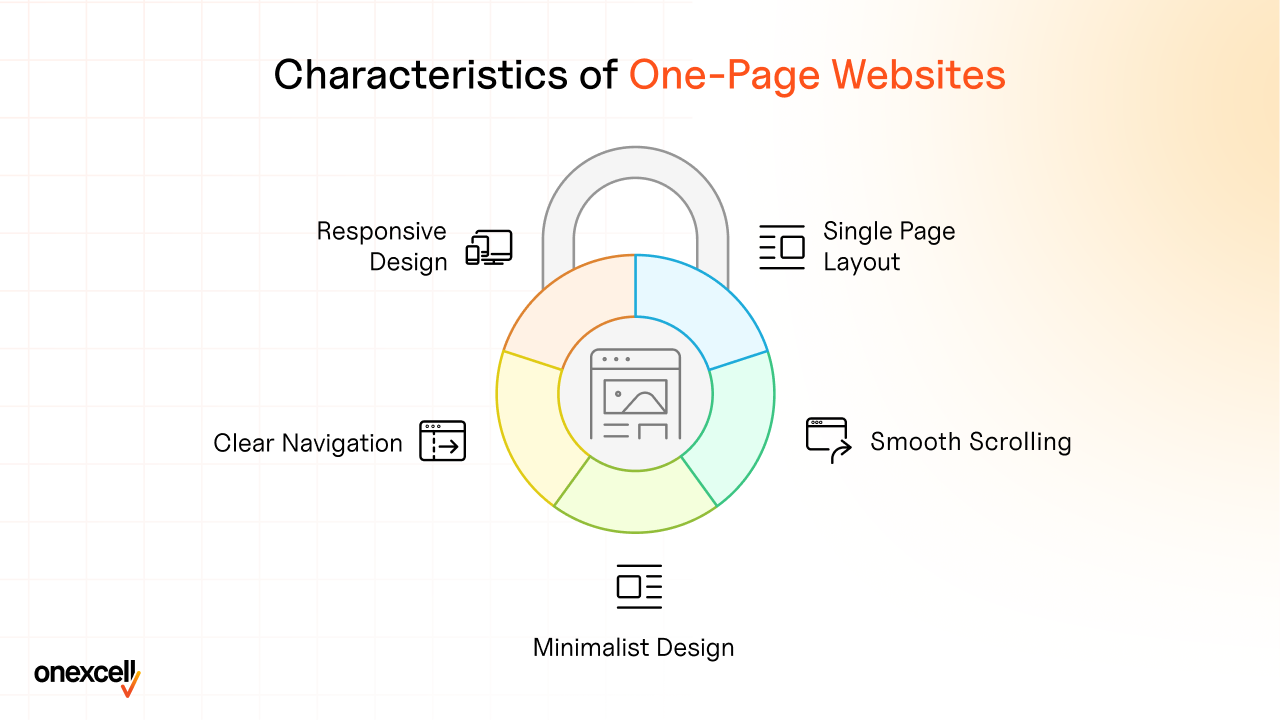
Below are the key characteristics that make a one-page website unique and effective: single-page layout, smooth scrolling, minimalist design, straightforward navigation, responsive design, fast loading speed, concise content, strong visuals, interactive elements, focused call-to-action (CTA), SEO optimization, consistent branding, engaging storytelling, analytics integration, and a user-friendly interface.
1. Single Page Layout
A streamlined site places all the content on one page, removing the need to navigate multiple tabs. This layout simplifies browsing, enabling users to find information quickly and boosting engagement by minimizing distractions.
2. Smooth Scrolling
Users effortlessly move through the content with continuous scrolling, creating a seamless journey. This intuitive navigation keeps users engaged and reduces the chance of prematurely leaving the site.
3. Minimalist Design
While focusing on focused content and avoiding clutter, minimalist designs improve readability and ensure the message stands out. This simplicity makes the site more appealing and less overwhelming for users.
4. Clear Navigation
A minimal navigation structure, often in sticky menus or anchor links, allows users to jump directly to sections. This feature enhances usability and ensures visitors can access the desired information without confusion.
5. Responsive Design
Adapting the website for various devices ensures that users enjoy a consistent experience, whether on a smartphone, tablet, or desktop. Responsive design improves user satisfaction and accessibility, which are critical factors in user retention.
6. Fast Loading Speed
One-page websites load faster due to fewer assets, such as fewer images and scripts. A quick-loading site enhances user experience, as 53% of users abandon pages that take more than 3 seconds to load.
7. Concise Content
Content is kept short and to the point, presenting only the most relevant information. This focused content approach respects the user’s time and ensures they stay engaged throughout their visit.
8. Strong Visuals
High-quality visuals, including full-screen sections and engaging animations, capture attention and evoke emotions. This creates a memorable experience and encourages users to explore the site further.
9. Interactive Elements
Dynamic features like hover effects, parallax scrolling, and videos make the site interactive and engaging. These elements guide users naturally through the content and leave a lasting impression.
10. Focused Call-to-Action (CTA)
With a single CTA, users are guided toward a specific action, such as signing up, purchasing, or contacting. This clarity improves conversion rates by reducing indecision.
11. SEO Optimization
Optimized loading speeds, targeted keywords, and streamlined navigation improve the site’s visibility on search engines. This results in better rankings and more organic traffic.
12. Consistent Branding
Uniform use of colors, fonts, and visual elements aligns the website with the brand identity. Consistent branding builds trust and enhances the overall professional appeal of the site.
13. Engaging Storytelling
Full-screen sections and a logical flow of content help narrate a story, keeping users intrigued. Storytelling adds emotional depth to the user experience, making the website more relatable.
14. Analytics Integration
Tracking user behavior like scroll depth and engagement provides actionable insights. These insights help refine the website’s design and improve user satisfaction over time.
15. User-Friendly Interface
Combining minimal navigation and intuitive design, the site becomes accessible to all users, even those with limited technical knowledge. A user-friendly interface boosts retention and ensures a positive experience.
Each characteristic of a one-page website is designed to create a seamless, engaging, and efficient user experience, catering to modern browsing preferences.
Need to ask Something else?
Use the form here to send us your question. We’ll reply within one business day.
What is the difference between One-page and multi-page websites?
The difference between a one-page website and a multi-page website lies in their structure, design approaches, and user experience.
A one-page website offers a streamlined layout with minimal navigation, making it user-friendly and engaging. It is perfect for portfolios, single-product showcases, or event promotions where concise content is key. The advantages include enhanced user engagement through seamless scrolling, faster loading speeds, and better mobile responsiveness.
However, the limited space for detailed information and challenges in SEO optimization for diverse keywords are potential drawbacks.
On the other hand, a multi-page website, also referred to as a full website or multi-navigation website, is designed to handle extensive content. It is ideal for businesses, e-commerce platforms, or blogs that require separate sections for services, products, or articles. The benefits of a multi-page design include the ability to accommodate detailed information, better SEO optimization across a range of keywords, and scalability for growth.
However, users will find navigation overwhelming, and poorly optimized sites suffer from slower loading times.
Why Are One-Page Websites Popular in Modern Web Design?
One-page websites are popular because they align perfectly with the needs of modern web users, offering simplicity, speed, and a mobile-first approach.
According to Statista’s report titled “Mobile Internet Traffic Share Worldwide” in 2024, over 55% of global web traffic now comes from mobile devices. This highlights the growing importance of mobile-friendly websites, and one-page websites are well-suited to provide a better user experience. Their single-scroll layout ensures seamless navigation and readability on smaller screens, making them ideal for mobile users.
From an SEO-friendly perspective, one-page websites focus on specific keywords, allowing them to rank effectively for targeted searches. Additionally, the simplicity of a one-page design ensures that users are not overwhelmed with excessive information. With simplified content management, businesses must update and maintain their website more efficiently, saving time and resources.
What are Examples of One-Page Websites?
Below are some examples of one-page websites that showcase unique designs, user-friendly experiences, and effective branding. Each website stands out for its simplicity, responsiveness, and user engagement strategies, making them excellent case studies in modern web design.
Upstate Laundromat
Upstate Laundromat’s website offers a clean, minimalist design with clear call-to-action buttons and a straightforward layout. Its simple color scheme and intuitive structure help users find key information quickly, making it effective for its target audience.
The Rafael
The Rafael features a visually stunning design with full-screen images and bold typography, creating an immersive experience for users. The layout emphasizes high-quality visuals with minimal text, allowing users to focus on the images while still accessing vital information.
Full-screen sections with high-quality visuals and interactive animations engage users, creating a memorable experience. Research from HubSpot in 2023 shows that websites with strong visuals have a 94% higher chance of user engagement.
Weinbau Strenger
Weinbau Strenger’s website uses a sleek, professional design that combines minimalist elements with bold visuals. The elegant layout highlights high-quality images and minimal text, allowing the website to effectively communicate its message without overwhelming the user.
Every Last Drop
Every Last Drop engages users with interactive content and visual storytelling, making it a standout example of how design enhance user engagement. The website incorporates interactive elements that guide users through the content, keeping them invested in the journey.
Gary Sheng
Gary Sheng’s portfolio website uses a clean design with easy navigation, presenting his work in a minimal yet engaging format. The website is simple and organized, showcasing his projects in an easy-to-digest layout.
The clear navigation and minimalistic presentation of portfolio items keep users focused on the work itself, rather than extraneous content.
Swappa Bottle
Swappa Bottle’s website is a product-focused one-page site that emphasizes clarity and ease of navigation. Large product images and bold call-to-action buttons ensure users quickly understand the product offering and take action.
Garden Studio
Garden Studio’s website uses large visuals to showcase its products in an elegant and immersive way. The streamlined design ensures that users explore the site’s offerings without feeling overwhelmed by content. With smooth scrolling and clear typography, the site creates a user-friendly browsing experience.
Mark My Images
Mark My Images’ website uses dynamic scrolling effects and high-quality images to engage users in a visually rich layout. The site’s use of dynamic scrolling and large, attractive images ensures that users stay on the site longer.
Research from Wistia in 2023 suggests that dynamic content, like scroll-based animations, can increase user interaction by 30%, which is evident in Mark My Images’ design.
Refire
Refire’s website stands out for its bold design and vibrant aesthetic. The website uses full-screen background images and minimal text, giving it a modern and visually impactful feel. With interactive animations that enhance the user experience, the site engages users from the moment they arrive.
Josef Kjærgaard
Josef Kjærgaard’s personal website features a minimalist design that highlights his portfolio. The website uses simple navigation and a clean layout to focus on his work, with clear categorization making it easy for visitors to explore his projects.
Kelly Clarkson And Apartments
The Kelly Clarkson and Apartments website uses a vibrant, immersive design that showcases luxury apartments through bold visuals and easy-to-navigate sections. Full-screen images provide a strong visual experience, while clear typography and interactive elements guide the user through the information.
Video Creator Course
The Video Creator Course website focuses on education, using clear calls-to-action and easy navigation to convert visitors into students. The design is simple but effective, guiding users through course information and features with minimal distractions.
Freelance Brain
Freelance Brain’s website centers around a clean and simple design with engaging animations that bring the content to life. The website uses interactive elements that increase user retention and make navigation fun.
Portrayalist
Portrayalist uses full-screen images and smooth scrolling to showcase its photography portfolio, allowing users to engage with each project in depth. The clean, minimalistic design ensures that visitors are not distracted by unnecessary content and should focus solely on the visuals.
SubZero Ice Cream
SubZero Ice Cream uses a playful design with interactive animations to create a fun and engaging experience for visitors. The website’s bright visuals and engaging features capture the user’s attention while making it easy to navigate through product offerings.
Interactive elements, like animations, are proven to increase user engagement.
What Industries Are Best for One-Page Websites?
Below are industries that are best suited for one-page websites due to their need for simplicity, direct communication, and ease of navigation. A one-page website is ideal for businesses and individuals looking to offer a concise, visually appealing online presence.
Freelancing and Consulting
Freelancers and consultants often benefit from one-page websites as they need to showcase their expertise, services, and contact information in a straightforward manner. One-page sites allow potential clients to quickly access relevant details without unnecessary distractions.
Creative Portfolios
One-page websites are ideal for creative professionals like designers, writers, and artists who need to display their work in a visually engaging and easy-to-navigate format. With full-screen visuals, concise descriptions, and easy navigation, a one-page site helps creative professionals.
Event Planning
Event planners benefit from one-page websites due to the ability to focus on essential event details such as dates, location, and services. A one-page site provide all the necessary information, including booking options, in a straightforward and easy-to-find format.
Restaurants and Cafes
Restaurants and cafes effectively use one-page websites to showcase their menu, location, hours of operation, and customer reviews. By keeping it simple, they ensure customers quickly find essential information.
Startups
Startups use one-page websites to communicate their brand, mission, and product offering without overwhelming potential customers or investors. A clean, simple design help highlight the company’s core message and create an immediate impact.
According to a study by Forbes titled “20 Ways to Showcase a Company’s Strengths on Its Website’s Homepage” in 2023, startups with one-page websites experienced 40% faster conversion rates compared to those with multi-page designs.
Non-Profit Organizations
Non-profits benefit from one-page websites because they allow them to clearly communicate their mission, upcoming events, donation options, and volunteer opportunities in a streamlined manner. One-page websites make it easier for visitors to take action, such as making a donation or signing up to volunteer.
Personal Branding
Individuals looking to build their personal brand should effectively showcase their skills, achievements, and testimonials with a one-page website. By focusing on key details and minimizing distractions, a personal branding website becomes a powerful tool to make a lasting impression.
Small Businesses
For small businesses with limited resources, one-page websites offer a cost-effective solution to establish an online presence. A one-page site allows small businesses to present their services, contact details, and brand values clearly and concisely.
Product Launches
One-page websites are ideal for promoting product launches as they allow businesses to focus on the product’s key features, benefits, and launch date without unnecessary distractions. Clear call-to-action buttons make it easy for users to sign up for updates or pre-order the product.
Wedding Planning
Wedding planners must use one-page websites to display essential details about the wedding, such as the date, location, registry, and RSVP options. One-page designs allow couples and guests to quickly find all necessary information without navigating through multiple pages.
Fitness and Personal Training
Fitness trainers and personal coaches must use one-page websites to showcase their services, certifications, and client success stories. The clean, simple layout allows potential clients to get all the information they need quickly and efficiently.
Research by the American Council on Exercise titled “The Impact of Streamlined Websites on Fitness Conversions” in 2023 revealed that personal trainers with one-page websites see 15% more sign-ups for their programs due to a more focused user experience.
Photography
Photographers should use one-page websites to showcase their portfolio with high-quality images that immediately grab the viewer’s attention. The streamlined design allows potential clients to browse through a photographer’s work without the distractions of a multi-page website.
Travel and Tourism
Travel agencies and tour operators must use one-page websites to present key details about destinations, packages, and booking options. This helps travelers quickly find the information they need to make decisions.
Fashion and Beauty
Fashion and beauty brands should use one-page websites to showcase their latest collections, products, and promotions in a visually appealing and streamlined format. By focusing on the visuals and providing essential product information, one-page sites encourage users to make a purchase.
Digital Marketing
Digital marketing agencies often use one-page websites to showcase their services, case studies, and client testimonials in a succinct and focused format. This helps potential clients quickly understand the agency’s offerings and expertise.
What Are the Main Ideas for Conceptualizing a One-Page Website?
Here are some key ideas for conceptualizing a one-page website. Each design concept plays an essential role in enhancing user engagement, optimizing functionality, and improving overall user experience. These strategies are proven to drive better outcomes for businesses and users alike.
Clear Purpose
A clear purpose sets the foundation for any successful website. By defining what the website intends to achieve—whether it’s making a sale, educating users, or promoting a service.
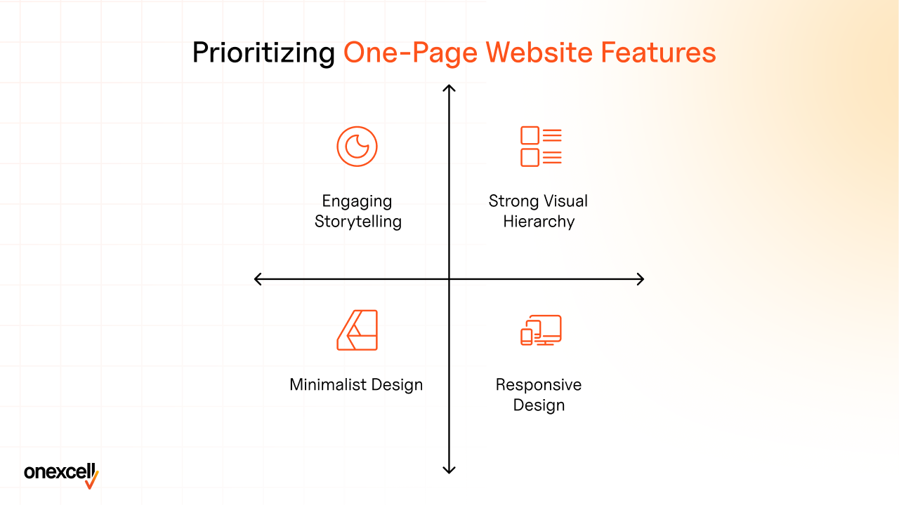
Strong Visual Hierarchy
Strong visual hierarchy directs users’ attention to the most important elements on the page first. By using varying font sizes, contrasting colors, and strategic placement, the design ensures users quickly understand the key message and action steps.
Research by Nielsen Norman Group in 2023 revealed that websites with an effective visual hierarchy experience up to a 35% increase in user engagement.
Engaging Storytelling
Using a narrative format allows the website to guide users through a journey, making the experience more engaging. Storytelling makes content memorable and encourages users to stay longer on the site.
Compelling Call-to-Action (CTA)
A compelling CTA is crucial in converting visitors into leads or customers. By making the call-to-action clear, prominent, and enticing, you guide the user to take action.
Minimalist Design
A minimalist design focuses on simplicity, removing unnecessary elements and ensuring that every component serves a purpose. This design helps prevent overwhelming visitors with too much information.
Smooth Scrolling
Smooth scrolling enhances the user experience by offering a seamless flow from one section to the next. This feature not only keeps users engaged but also creates a more interactive and visually appealing experience.
Responsive Design
Responsive design ensures the website looks great and functions well across all devices, including smartphones, tablets, and desktops.
As mobile traffic now accounts for over 50% of global internet usage, responsive websites have a 25% higher engagement rate. This is supported by the study “Mobile-First Design Trends” by Statista in 2023.
High-Quality Images and Videos
High-quality visuals—especially images and videos—are critical for creating an impactful user experience. They help convey messages quickly and effectively.
Interactive Elements
Interactive elements, such as hover effects, animations, and clickable sections, make the user experience more engaging. These features encourage exploration and provide instant feedback, making the website feel more dynamic.
Consistent Branding
Consistent branding across a website enhances the trust and recognition of the brand. It ensures that the logo, colors, typography, and messaging are uniform throughout the site, creating a cohesive identity.
SEO Optimization
SEO optimization ensures that the website ranks well in search engine results, making it easier for users to find the site. By optimizing on-page elements like titles, descriptions, and images, websites significantly improve their search rankings.
Fast Loading Speed
A fast loading speed is essential for keeping users engaged. Slow websites frustrate users and often lead to higher bounce rates.
Additionally, a study by Akamai titled “The State of Online Retail Performance” found that a 100-millisecond delay in website load time can decrease conversion rates by 7%.
User-Friendly Navigation
Easy navigation ensures users quickly find the information they’re looking for. A well-structured, intuitive layout contributes to a better user experience.
Analytics Integration
Analytics integration allows you to track user behavior and gather insights on how visitors interact with the site. This information will guide future design and content decisions.
Social Proof
Including testimonials, reviews, and case studies as social proof helps build trust with users and will influence their decision-making. Positive reviews and user-generated content serve as validation of your product or service.
Are one-page best for certain scenarios?
Yes, one-page websites work best for certain situations because they offer a simple, focused design that is easy to navigate. For example, they are perfect for product launches, and personal portfolios because they allow creative professionals to showcase their work in a clear and organized way.
One-page websites are also great for events like conferences or weddings. For small businesses or startups, one-page websites help customers find what they need quickly without getting lost in too many pages.
Does a one-page website improve user experience?
Yes, a one-page website improves user experience by offering easy navigation and a streamlined design. With all the content in one place, users don’t have to click through multiple pages to find what they need. For example, a simple product page or event landing page allows users to quickly get information without distractions.
Innovative Ideas for Designing One-Page Websites
Some innovative ideas include parallax scrolling, interactive storytelling, VR, AR, micro-interactions, and striking visuals that transform a one-page website into an engaging and interactive user experience. Here is a brief explanation for the same:
Parallax Scrolling
This technique creates a 3D effect by making the background move slower than the foreground, adding depth and visual interest as users scroll.
Interactive Storytelling
By incorporating dynamic content and animations, interactive storytelling keeps users engaged as they actively explore and experience the website’s narrative.
Virtual Reality (VR) Elements
VR allows users to explore products or services in a fully immersive 3D environment, enhancing engagement through realistic virtual experiences.
Augmented Reality (AR) Features
AR blends digital elements with the real world, allowing users to interact with products in their own environment, like trying on virtual items or visualizing furniture in their space.
Micro-interactions and Striking Visuals
Small interactive elements like hover effects and animated buttons, combined with bold visuals, create a responsive and visually captivating experience.
Steps Involved in the Design and Development of a One-Page Website

Below are the essential steps involved in the design and development of a one-page website. The steps are: Define Purpose and Goals, Research and Inspiration, Create a Wireframe, Design the Layout, Develop the Content, and more. Each step plays a crucial role in ensuring the functionality and user engagement of the website.
1. Define Purpose and Goals
Clearly define the website’s purpose—whether to promote a product, showcase a portfolio, or provide information. This helps shape the direction of the design and development process.
2. Research and Inspiration
Conduct research into industry trends, competitors, and user needs to gather inspiration. This will ensure the website aligns with what users expect and industry standards.
3. Create a Wireframe
A wireframe outlines the basic structure of the website, showing where content and elements will go. It serves as a blueprint for the website’s layout and flow.
4. Design the Layout
Designing the layout involves choosing color schemes, typography, and imagery. A well-structured layout enhances user experience, making the site visually appealing and easy to navigate.
5. Develop the Content
Content creation is vital to effectively communicate the website’s message. Clear and engaging copy, images, and videos will help users connect with the website’s goals.
6. Choose a Platform or CMS
Select a platform like WordPress, Wix, or Squarespace based on your design needs and functionality. A good CMS ensures ease of use and flexibility in managing content.
7. Implement the Design
The implementation phase includes coding the website, integrating the design with the CMS, and ensuring that all elements work smoothly.
8. Add Interactive Elements
Interactive features such as hover effects, scroll animations, or clickable buttons enhance user engagement. Interactive sites keep users engaged longer, leading to better retention.
9. Optimize for SEO
Ensure the website is SEO-friendly by using relevant keywords, optimizing images, and adding meta descriptions. This will help improve search engine rankings and visibility.
10. Test for Responsiveness
Test the website on various devices and screen sizes to ensure it works well on mobile phones, tablets, and desktops. Responsive design increases user retention and satisfaction.
11. Conduct Usability Testing
Usability testing helps identify any issues in navigation or functionality. Websites that undergo usability testing are more likely to meet user needs, ensuring a positive experience.
12. Launch the Website
Once everything is set, launch the website to the public. Make sure everything works smoothly and monitor user interactions to spot any issues quickly.
13. Monitor Performance
After launching, monitor the website’s performance, including load times and user behavior. Websites with faster load times will see up to an improvement in user retention.
14. Gather Feedback
Collect feedback from users through surveys or analytics to understand their experience. Feedback helps identify areas for improvement and optimize user engagement.
15. Make Improvements
Based on the feedback, continuously improve the website’s design, content, and functionality. Regular updates keep the website fresh, improving long-term user engagement. Websites that undergo regular updates show a 30% increase in engagement over time, as reported by Wix, in their article, “How Regular Website Updates Improve Engagement,” published on May 24, 2022.
How does minimalism and responsiveness enhance one-page websites?
Design principles like minimalism and responsiveness significantly enhance the user experience of a one-page website. Minimalism focuses on simplicity, using clean layouts, limited colors, and minimal navigation to create an uncluttered design. This allows visitors to focus on key information without distractions.
However, a responsive web design ensures that all users, regardless of device, have an optimal browsing experience, improving retention and satisfaction.
How Should Content Be Arranged on a One-Page Website for Optimal Engagement?
Content should be arranged with a clear focus on guiding users smoothly. Use visual hierarchy to highlight important elements, like headlines and CTAs. Organize the content in a narrative structure, leading users from introduction to action. Add engaging animations to keep the flow interactive and exciting.
For more insights, explore Web design strategies.
How to Ensure Mobile-Friendliness in One-Page Websites
Ensuring mobile-friendliness in one-page websites is essential to provide a seamless experience for users on various mobile devices. Below are key steps you take to make sure your site performs well across smartphones and tablets:
Responsive Design
Responsive design ensures that your website automatically adjusts its layout based on the device’s screen size. This means your one-page website will look great whether it’s viewed on a desktop, tablet, or smartphone. It is a foundational aspect of creating mobile-friendly sites.
Flexible Images and Media
Images and media files should be adaptable to different screen sizes. Using flexible images that scale based on the device’s screen ensures they don’t break the layout or slow down the website’s performance.
Touch-Friendly Navigation
Navigation should be designed for touch screens. This means making buttons large enough to tap and ensuring that menu items are easy to navigate with fingers. A touch-friendly interface enhances the mobile experience by preventing frustration.
Optimized Loading Speed
Mobile users often have slower internet connections, so optimizing your website’s loading speed is crucial. Compressing images, using lazy loading, and minimizing HTTP requests significantly improve mobile performance.
Readable Fonts
Fonts must be large enough to read on smaller screens without zooming in. Clear and legible typography contributes to better mobile accessibility and a more user-friendly design.
Simplified Content
Keep content concise and to the point, as mobile users typically prefer quick and easy-to-read information. A simplified layout and content hierarchy will ensure that key messages are conveyed effectively.
Mobile-First Approach
Designing with a mobile-first approach means starting the design process for the smallest screen and then gradually adjusting it for larger screens. This ensures that the mobile version of your website is fully optimized before moving to desktop views.
Test on Multiple Devices
Testing your website across various devices (iOS, Android, tablets, etc.) helps to ensure consistency. Emulators will be helpful, but real-world testing offers a more accurate view of mobile-friendliness.
Use Mobile-Friendly Plugins
Choose plugins that are optimized for mobile performance. Many website features, like forms or sliders, have mobile-friendly alternatives that improve loading time and functionality.
Avoid Pop-Ups
Pop-ups will be intrusive on mobile devices and cause frustration. If necessary, use smaller pop-ups or avoid them altogether to improve the mobile user experience.
Optimize Forms
Forms should be easy to fill out on mobile devices. Use larger input fields, simple dropdown menus, and avoid long forms to make sure users don’t face difficulty while submitting their details.
Use Media Queries
Media queries allow you to apply different styles based on the device’s characteristics, such as screen width and resolution. This is an essential technique in responsive design that helps tailor the site’s appearance to various devices.
Minimize CSS and JavaScript
Minimizing the size of CSS and JavaScript files improves loading speed and performance on mobile devices. Compressing and optimizing these files reduces data usage and makes your website run faster.
Enable Browser Caching
Browser caching stores elements of the website on a user’s device, allowing pages to load faster when they revisit. It is a simple but effective way to boost mobile performance.
Regular Updates and Testing
Mobile devices and browsers are constantly evolving, so it’s essential to keep your website updated. Regularly test your site after updates to ensure mobile-friendliness is maintained.
How can calls-to-action be positioned on a one-page website?
Mobile devices and browsers are constantly evolving, so it’s essential to keep your website updated. Regularly test your site after updates to ensure mobile-friendliness is maintained.
A call to action (CTA) is strategically placed on a one-page website to boost engagement and conversions. A strong CTA positioned above the fold, where userssee it immediately without scrolling, captures attention quickly and encourages prompt action.
How to ensure mobile-friendliness in one-page websites?
Ensuring mobile-friendliness in one-page websites is essential to provide users with a seamless experience. Below are key steps to achieve a mobile-optimized website:
Responsive Design
Implement responsive design to ensure the website adjusts seamlessly to different screen sizes and resolutions, enhancing usability on mobile devices.
Flexible Images and Media
Use scalable images and videos that adapt to screen sizes without losing quality or causing layout issues.
Touch-Friendly Navigation
Design navigation elements, buttons, and links that are easy to tap without accidental clicks.
Optimized Loading Speed
Compress images, minimize code, and leverage caching to reduce loading times, crucial for mobile performance.
Readable Fonts
Use clear, legible fonts and appropriate text sizes to ensure readability on smaller screens.
Simplified Content
Keep content concise and scannable, prioritizing key information for better engagement.
Mobile-First Approach
Design with mobile users in mind first, ensuring core functionality works seamlessly on small screens.
Test on Multiple Devices
Regularly test the website on various devices and operating systems to identify and fix any issues.
Use Mobile-Friendly Plugins
Choose plugins optimized for mobile to avoid functionality or performance issues.
Avoid Pop-Ups
Minimize intrusive pop-ups that frustrate users and harm mobile experience.
Optimize Forms
Create simple, user-friendly forms with minimal fields and mobile-friendly layouts.
Use Media Queries
Implement CSS media queries to tailor styles for different devices and screen sizes.
Minimize CSS and JavaScript
Reduce unnecessary CSS and JavaScript to improve performance and load times.
Enable Browser Caching
Allow caching of static files to speed up subsequent visits on mobile devices.
Regular Updates and Testing
Continuously update and test the website to ensure compatibility with the latest devices and browsers.
What is the Cost of Developing a One-Page Website?
The cost of developing a one-page website is influenced by several factors, typically ranging from £240 to £2400 or more. Design complexity plays a major role—custom designs with advanced features like animations or parallax scrolling cost more than basic templates. Features and functionality such as contact forms, interactive elements, or integrations with third-party tools also add to the cost.
What Elements Influence the Overall Cost of Creating a One-Page Website?

Below are the key factors that determine the cost of developing a one-page website. Each element plays a vital role in shaping the budget based on design, features, and ongoing requirements.
1. Design Complexity
The level of detail in the design affects costs significantly. Custom layouts, unique animations, and visually striking interfaces require more effort and expertise.
2. Custom Graphics and Images
Bespoke graphics, illustrations, and high-quality images add to the aesthetic appeal but also increase the design budget.
3. Content Creation
The cost includes writing compelling text, creating engaging visuals, and structuring content effectively. High-quality content requires professional writers or creators.
4. Development Time
More complex features and functionality translate into longer development hours, raising the overall cost.
5. Platform or CMS
Using a CMS like WordPress reduces costs, but custom platforms or frameworks may be more expensive due to tailored development.
6. SEO Optimization
Integrating SEO strategies to improve search rankings involve additional costs for keyword research, metadata creation, and technical SEO fixes.
7. Mobile Responsiveness
Ensuring a seamless experience on mobile devices involves additional design and testing efforts, impacting the cost.
8. Interactive Elements
Features like parallax scrolling, animations, or hover effects enhance user experience but demand higher development budgets.
9. Hosting and Domain
The choice of hosting provider and domain name influences the ongoing cost of keeping the website live.
10. Maintenance and Updates
Regular updates, bug fixes, and content refreshes require ongoing investment to keep the website functional and secure.
11. E-commerce Features
Adding shopping carts, payment gateways, and product listings significantly increase the cost of a one-page website.
12. Analytics Integration
Setting up tools like Google Analytics for performance tracking may require additional setup costs.
13. Security Measures
Investing in SSL certificates, firewalls, and other security features ensures data protection but adds to the budget.
14. Third-Party Integrations
Integrating tools like CRMs, email marketing platforms, or chatbots will add functionality but also increase expenses.
15. Project Management
Proper planning, coordination, and communication among the team ensure smooth execution but may incur project management costs.
How does the cost of a one-page website compare to that of a multi-page site?
The cost of a one-page website compared to a multi-page site is typically lower due to reduced development and maintenance requirements. A one-page site focuses on simplicity, requiring fewer design elements, less content creation, and shorter development time. According to industry estimates, a one-page website will cost between £400 to £4000, while a multi-page site ranges from £2,400 to £4,000 or more, depending on complexity. Factors like design customization, SEO, and interactive features contribute to the variation.
What are the key benefits of choosing a one-page website for a business?
Below are the key benefits of choosing a one-page website and how they improve business performance:
1. Simplified Navigation
A one-page website ensures all the information is in one place, making it easy for users to find what they need quickly. Studies show that 76% of users prefer websites with straightforward navigation.
2. Faster Loading Times
One-page websites load faster due to fewer elements, improving user satisfaction. A Google study reveals that websites loading in under 3 seconds see 53% lower bounce rates.
3. Cost-Effective
With fewer pages to design and develop, one-page websites are more affordable, costing 30–50% less than multi-page websites.
4. Mobile-Friendly
Responsive design ensures one-page websites look great on all devices, crucial since 58% of web traffic comes from mobile users.
5. Enhanced User Experience
The minimal design and intuitive structure provide a seamless user experience, which boost user engagement by up to 20%.
6. Clear and Focused Content
Condensing all information on one page ensures content is concise and impactful, helping businesses convey their core message effectively.
7. Improved SEO
By targeting specific keywords and providing a smooth user experience, one-page websites often rank higher on search engines, improving organic visibility.
8. Higher Conversion Rates
With a single, streamlined call-to-action, one-page websites increase conversion rates by 10–15%, as users are less distracted.
9. Easy Maintenance
Updating a single page is simpler and faster, saving time and reducing maintenance costs.
10. Consistent Branding
A one-page layout helps maintain a cohesive brand image, ensuring design and messaging consistency.
11. Engaging Storytelling
Creative elements like parallax scrolling and animations make it easier to tell a compelling story, increasing engagement.
12. Streamlined Analytics
Tracking user behavior is simpler, with all data concentrated on one page, making it easier to analyze and optimize.
13. Reduced Bounce Rate
Faster loading times and engaging design lower bounce rates, improving user retention.
14. Quick Development
A one-page website can be developed in half the time of multi-page websites, allowing businesses to launch faster.
15. Better Social Sharing
A simple and focused design encourages users to share, increasing visibility and reach on social platforms.
How do one-page websites facilitate faster loading times?
A one-page website facilitates faster loading times by minimizing the number of HTTP requests required to load multiple pages. Since all content is contained on a single page, there is no need for frequent page transitions, which significantly reduces server load and wait times. Techniques like lazy loading, where images and elements load only as users scroll, further optimize performance by prioritizing essential content first.
What SEO advantages do one-page websites offer?
One-page websites offer several SEO advantages that boost search rankings and improve visibility. Their streamlined structure allows for better SEO optimization, as all content is centralized on a single page, making it easier to target specific keywords and maintain a clear focus. They also simplify on-page SEO, ensuring meta tags, headings, and URLs are well-optimized without the complexities of managing multiple pages.