A web design audit gives you a chance to spot any web design mistakes, usability issues, or SEO problems that might be keeping visitors away.
It also allows you to keep up with the latest design trends. What was cutting-edge yesterday might be outdated today. By performing a regular audit, you make sure your website stays relevant.
So, which areas do you need to check during a web design audit? Keep reading to find the answers.
7 Areas to Check During Web Design Audit
It’s true that mastering web design best practices is the first step toward success. But regularly conducting a web audit is how you ensure that success continues.
Let’s go through each element that’s crucial for your site:
1. Performance
When it comes to your website’s performance, speed is everything. In fact, 47% of online users expect websites to load in two seconds—so if your site is lagging, visitors will just abandon your site in seconds.

A website performance and speed audit is your secret weapon to ensure that your site runs well and aligns with your business goals.
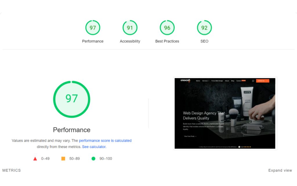
You can use tools like Google PageSpeed Insights or GTmetrix to get the job done. These tools analyse key metrics like page load time, server response time, and overall site performance.
Questions to ask:
- How fast is your site loading? Does it meet the three-second expectation?
- Are your images optimised? Could compressing them speed up your site?
- Is your server response time quick enough? Is there a way to reduce it?
- Are unnecessary scripts slowing down your page? Could you remove or defer them?
For example, let’s say your audit reveals that your homepage takes five seconds to load. Not ideal, right? To tackle this, you could start by compressing images, reducing server requests, or even switching to a faster hosting provider.
Keeping an eye on these metrics and making small tweaks can have a huge impact, helping you meet user expectations and boost overall engagement.
2. Mobile Responsiveness
Former Google CEO Eric Schmidt was among the first well-known figures to champion the concept of mobile-first design.
In a 2011 keynote speech at the Mobile World Congress, he stated, “We understand that the new rule is mobile first. Mobile first in everything. And it means … that we have a role now to inform, to educate through all these devices.”
Even back then, he recognised that mobile screens were becoming the new standard for website viewing.

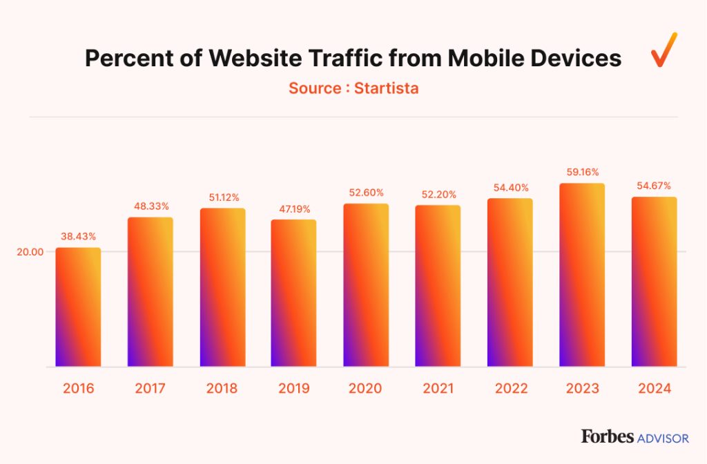
Fast forward today, and that insight couldn’t be more relevant. With over half of global web traffic coming from mobile devices, ensuring your website is mobile responsive should be the top priority.
A mobile responsiveness audit will help ensure that your site not only looks good on smaller screens but also functions flawlessly.
Questions to ask:
- Is your website layout adapting well to different screen sizes? Does it resize images, text, and menus accordingly?
- Are buttons and links easily clickable on mobile devices? Or are users struggling with small touch targets?
- Is mobile navigation simple and intuitive? Can users quickly find what they need without excessive scrolling or zooming?
- Does the page load quickly on mobile networks? Is there any unnecessary content or script slowing it down?
For example, if your site’s navigation menu is too cluttered on mobile screens, you can make it simpler by using a ‘hamburger’ icon and grouping similar pages under clear categories.
Additionally, ensure buttons are large enough to tap easily and that images scale correctly to prevent awkward cropping or zooming.
3. Search Engine Optimisation (SEO)

Organic search results bring 1,000% more traffic than social media.
While social media is still important, nothing quite matches the long-term, sustainable impact of a strong SEO strategy.

On-page SEO rules the content world, but it’s technical SEO that builds the foundation and structure your site needs to thrive. Both are crucial for a successful audit.
Questions to ask:
- Are your target keywords optimised throughout your content? Are they naturally integrated into titles, headings, and body text?
- Is your meta description compelling and keyword-rich? Does it encourage clicks from search engine results pages (SERPs)?
- Are your images optimised? Do they include alt text and compressed file sizes for faster loading?
- Are there any broken links or error pages? These can damage your user experience and hurt your rankings.
- Are you earning backlinks from reputable sources? Is your site considered an authority by search engines based on these links?
- How is your social media presence linked to your site? Are you driving traffic from external platforms back to your web pages?
- Do you have a strong local SEO strategy? Have you optimised for Google My Business, local citations, and location-specific keywords?
A common finding from a web audit is broken backlinks, which can weaken your site’s authority and SEO performance. To fix this, update your content to remove or replace the broken links.
Then, reach out to sites within the same niche to request new, relevant backlinks. Not only does this strengthen your site’s authority, but it also ensures your content stays relevant to your target audience.
4. User Experience (UX) and User Interface (UI)

In simple terms, UX is all about how a website feels to use—making sure it’s intuitive and easy to navigate.
On the other hand, UI is the visual aspect—the design elements like buttons, menus, and layouts that users interact with.
Balancing out those two means a step (or two) closer to the perfect website. In fact, research says a well-designed UI can increase your website’s conversion rate by up to 200%, while an improved UX can lead to conversion rates of up to 400%.
This shows just how crucial both are for achieving your business goals.
Questions to ask:
- Is the website easy to navigate? Can users find what they’re looking for quickly and without frustration?
- Is the user journey seamless from start to finish? Are there any barriers preventing users from completing key actions like making a purchase or signing up?
- Are buttons and links clearly visible and easy to click? Or are they hard to find or too small on mobile devices?
- Do the colours and fonts provide good readability and accessibility? Is your website visually appealing without being overwhelming?
- Are your calls to action (CTAs) clear and persuasive? Do they stand out on the page?
Now, let’s create this scenario: your site has a high bounce rate on your contact form because it’s long and tiring for users to fill out.
In that case, you need to make the process a lot shorter. For example, instead of one big form, break it down into multiple pages or sections with progress indicators.
Toptal has a great web design example you can learn from. They split the sign up process into multi-steps form with a nice transition and clear progress indicator.
This makes the process less overwhelming and encourages users to complete the form, ultimately reducing the bounce rate.
5. Accessibility

Accessibility in web design ensures that all users, including those with disabilities, can easily navigate and interact with your site.
You might not expect it, but less than 10% of websites in Europe are fully accessible, highlighting a huge gap in web development. Beyond being the right thing to do, accessibility is also smart business.

Ensuring your site is accessible broadens your reach and improves the user experience for everyone.
Questions to ask:
- Can users navigate the website using only a keyboard? This is crucial for people with motor impairments who can’t use a mouse.
- Are all images equipped with descriptive alt text? This helps visually impaired users who rely on screen readers to understand visual content.
- Is the text readable for all users? Are font sizes large enough, and do the colour contrasts meet accessibility guidelines?
- Are your forms accessible? Do they have clear labels, and can they be easily navigated using assistive technology?
For instance, many users with visual impairments struggle to navigate your website because your colour contrast is too low, making text difficult to read.
To fix this, you can increase the contrast between background and text colours to meet Web Content Accessibility Guidelines (WCAG) standards.
The solution includes using a darker font on a lighter background. This way, all users should be able to easily read and engage with your content.
6. Security

Website security is more critical than you ever thought. Shockingly, 12.8 million websites are currently infected with malware, according to SiteLock’s analysis of 7 million websites, and the average website faces 94 attacks daily.

This shows that even certified companies often overlook basic security protocols. For that reason, ensure your website is protected by performing a regular security audit.
Questions to ask:
- Are all software and plugins up to date? Are there any unpatched vulnerabilities that could be exploited?
- Do you have a strong password policy and multi-factor authentication (MFA) in place? Are all login points secure?
- Is your website protected by a firewall? Is it properly configured to detect and block potential threats?
- Are backups regularly created and stored securely? Can you quickly restore your website if it’s compromised?
- Do you have an SSL certificate installed? Is your website using HTTPS to ensure secure communication between users and your server?
One of the security measures you need to pay attention to are outdated plugins, which leaves you vulnerable to cyberattacks.
Additionally, if MFA hasn’t been properly implemented across all user accounts, your system will be more susceptible to unauthorised access.
To avoid this, you need to update all plugins to their latest versions to patch any known security flaws immediately.
After that, implement MFA across all user accounts and ensure it’s mandatory for any login attempts. This extra layer of security drastically reduces the risk of unauthorised access and strengthens your overall protection.
7. Content

A content audit helps you evaluate whether the information on your website is accurate, relevant, and up to date.
According to Suitejar, content that includes “misleading data” or outdated information is considered low quality in Google’s latest Search Quality Evaluator Guidelines.
Content becomes outdated when:
- Industry trends change
- New regulations or policies are introduced
- Your product or service offerings evolve
- Statistics and references are no longer accurate
When should you update your content? Regular reviews are great, but especially consider updates when new information becomes available or when your analytics show declining engagement.
Don’t know where to start? Google Analytics is a great choice. It helps you track page performance, bounce rates, and time spent on pages to identify content that needs improvement.
Questions to Ask:
- Is the content still relevant? Does it align with current industry trends, regulations, or your company’s offerings?
- Are the statistics and references up to date? Is any of the information outdated or inaccurate?
- Is the content performing well? Are users engaging with the page, or are bounce rates high?
- Does the content meet SEO best practices? Is it optimised for search engines and targeting the right keywords?
- Is the content helpful and informative? Does it answer your audience’s questions and provide value?
If your audit finds that a service page is no longer relevant, you might still get traffic, but users are leaving the page quickly because they can’t find what they need. You definitely need to update the page to reflect the change.
Conclusion
Performing a web design audit isn’t as scary as you might have imagined. In fact, it’s a vital step in ensuring your website is performing at its best.
Once completed, you’ll have much more room to improve, optimise, and create a better experience for your users.
Don’t have the time to perform an audit yourself? You can always hire a reputable agency like Onexcell.
Get in touch today, and let’s take your website to the next!

