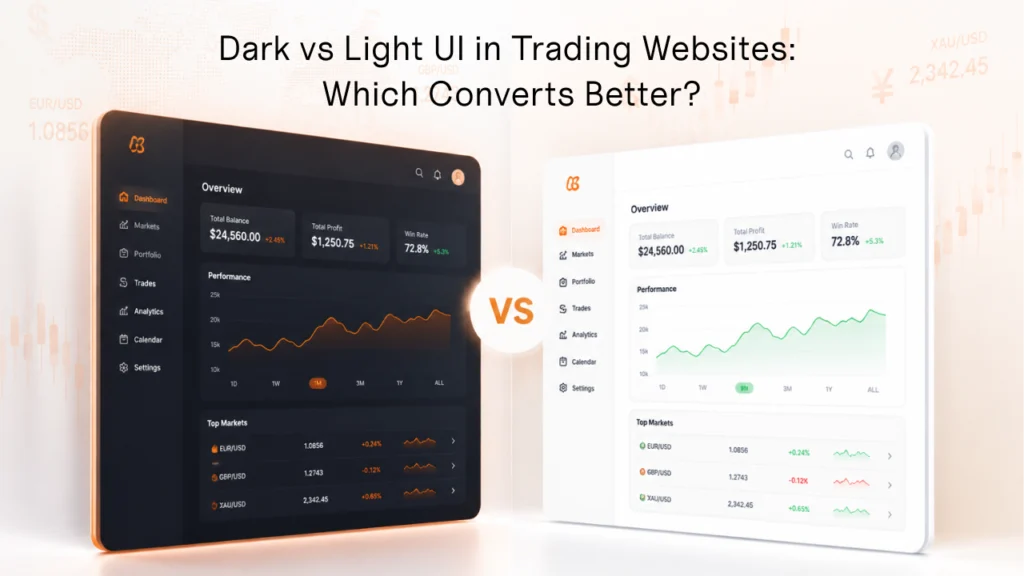
For forex trading websites, a dark UI usually converts better because traders prefer it and it signals a premium, focused, professional platform. That is why so many brokers lean dark. But here is the part most guides get wrong: a brokerage website is not just a trading platform. Going fully dark across the whole site is a mistake. The strongest brokers use a mostly-dark design with lighter sections where they make sense, and they commit to one well-crafted style rather than splitting their effort across two.
This guide shows you everything: why traders favour dark, why fully dark hurts a brokerage site, where light still wins, and why offering both a dark and a light version usually weakens your design. By the end, you will have the full picture, and you can decide which balance is right for your traders and your brand.
We design and build these interfaces every day at Onexcell, so the guidance here is practical, not theoretical.
Why Do Traders Prefer a Dark Trading Platform?
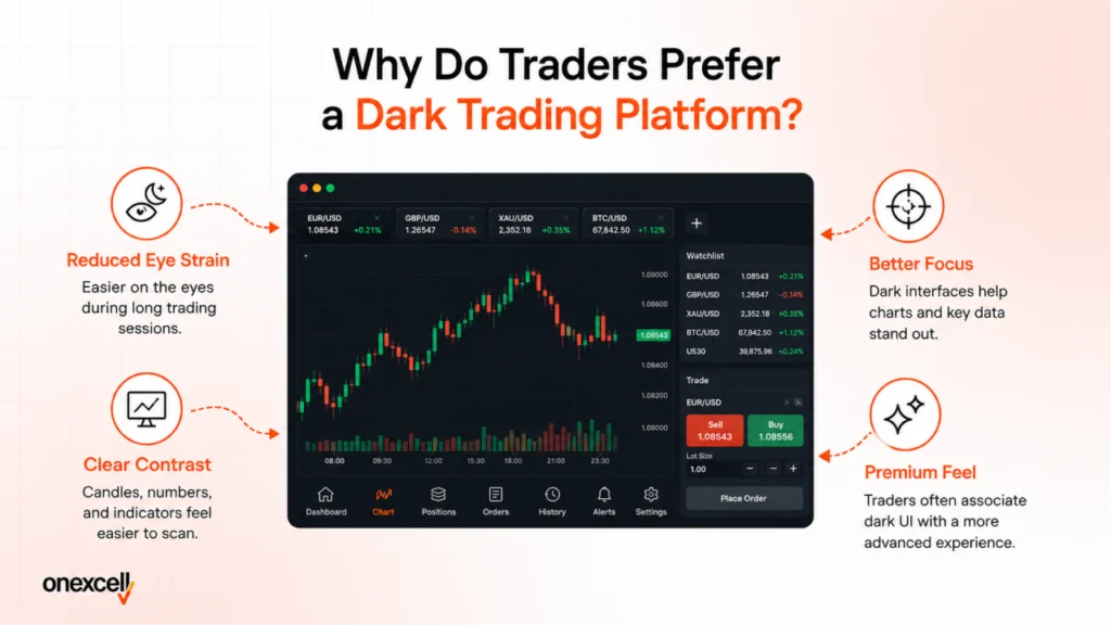
Traders prefer dark on the trading platform because they spend long hours on it, and dark feels calmer, more focused, and more professional. Look at the major trading platforms and broker dashboards, and the pattern is clear: the trading screen itself is almost always dark. Traders sit in front of charts and data for hours, often in the evening, and a dark interface is what they reach for. It reduces visual noise, helps them concentrate on price movement, and carries the serious, premium feel that traders associate with a real trading tool.
There are 4 reasons traders gravitate to dark on the trading screen:
- It suits long sessions. Hours of screen time, often at night, are more comfortable on a darker background with less glare.
- It helps focus. A dark canvas reduces visual noise so the eye locks onto charts, numbers, and price action.
- It feels premium and serious. Dark, high-contrast interfaces read as professional trading tools, which builds trust with active traders.
- It is what traders expect. Because most platforms are dark, traders are used to it, and meeting that expectation feels familiar and credible.
So, for the trading experience itself, the dashboard, the charts, and the live data, dark is the right default. That is rarely in question. The real decision is about the rest of the website.
Why Is a Fully Dark Brokerage Website a Mistake?
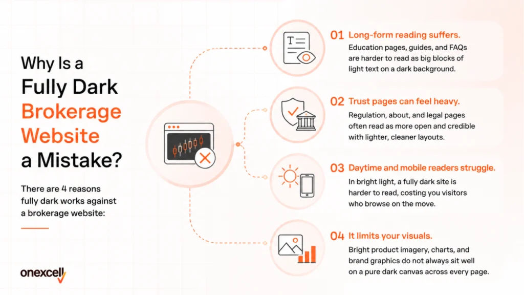
A fully dark website is a mistake because a brokerage site does much more than a trading platform, and not all of it works in the dark. The trading screen is one part of your site. Around it sit the homepage, the about and regulation pages, the education centre, the blog, the FAQs, and long forms. These are reading and trust-building surfaces, and forcing pure dark across all of them can hurt readability and feel heavy. Dark suits the platform; it does not automatically suit the whole brand site.
There are 4 reasons why fully dark works against a brokerage website:
- Long-form reading suffers. Education pages, guides, and FAQs are harder to read as big blocks of light text on a dark background.
- Trust pages can feel heavy. Regulation, about, and legal pages often read as more open and credible with lighter, cleaner layouts.
- Daytime and mobile readers struggle. In bright light, a fully dark site is harder to read, costing you visitors who browse on the move.
- It limits your visuals. Bright product imagery, charts, and brand graphics do not always sit well on a pure dark canvas across every page.
This is why the smart answer is mostly dark, not fully dark. Keep the trading experience and the premium hero dark, and let the reading-heavy and trust-building sections breathe with lighter, cleaner layouts where it helps.
Must read this blog: Best Examples Of Bad UI Design & How To Fix Them?
Where Does Light UI Still Win?
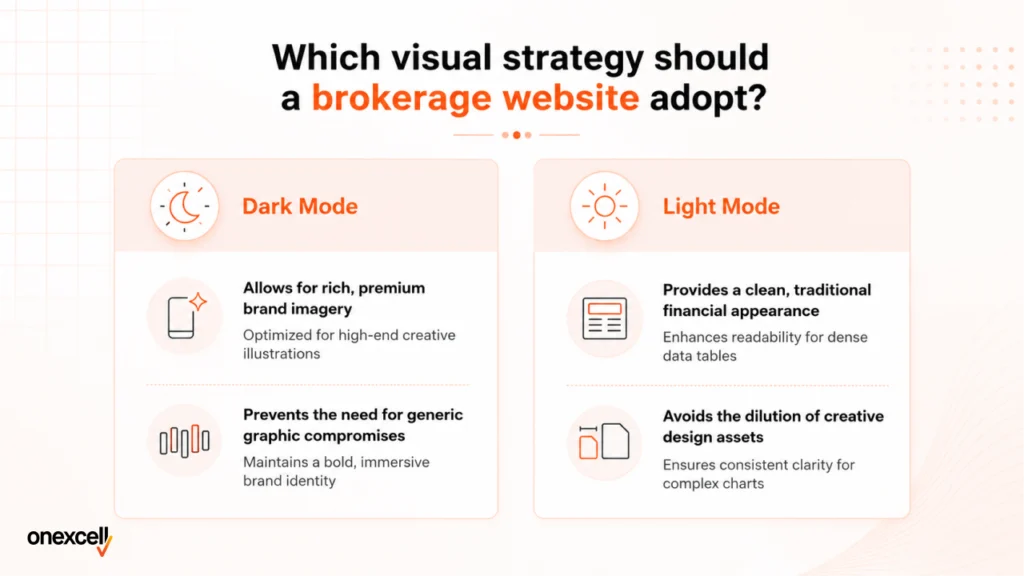
Light UI still wins for reading and for first-impression trust on certain pages. Dark is not better everywhere. For long text and for visitors who are still deciding whether to trust you, a clean light layout often converts better, because it is easier to read and feels open and familiar.
There are 4 places light UI tends to convert better:
- Education and guides. Long-form learning content is easier to read in light, which keeps visitors engaged.
- Blog and FAQ pages. Text-heavy pages hold attention better with dark text on a light background.
- Daytime and bright settings. Light is clearer in sunlight and bright offices, where many people browse.
- Accessibility for some users. People with astigmatism often read dark text on light backgrounds more easily.
None of this means going light overall. It means using lighter sections deliberately, inside an otherwise dark, premium site, where reading and clarity matter most.
Must read this blog: Generating Forex Leads: A Quick Guide in 5 Easy Steps
Should a Broker Offer Both a Dark and Light Version?
For a brokerage website, no. Building both a dark and a light version usually weakens your design, so it is better to commit to one strong style. It sounds generous to offer a full dark and light toggle, but for a broker, it comes at a real cost. A brokerage site relies on rich graphics, custom illustrations, brand imagery, and creative design to stand out and look premium. Creative built to shine on a dark background rarely translates cleanly to a light one, and the reverse is just as true. To support both, you end up simplifying your graphics so they work in either mode, and your whole site looks more generic as a result.
There are 3 reasons one committed style beats a dark and light toggle for brokers:
- Graphics stay strong. Designing for one background lets you use bold, premium visuals that are not watered down to fit both modes.
- The brand stays consistent. One style means every page feels intentional and on-brand, instead of two half-versions that never feel finished.
- You invest effort once. Building, testing, and maintaining two themes splits your design effort; one strong style gets your full attention.
Pro tip: Do not spread your design thin across two themes. Choose a direction, usually a mostly dark premium site with lighter reading sections, and craft it to a high standard with strong, original graphics. One excellent style will always out-convert two compromised ones.
How Do You Get a Mostly-Dark Trading Site Right?
A mostly-dark site only converts when it is readable, premium, and consistent, so the craft matters as much as the color. Dark is harder to execute well. Pure black with thin grey text strains the eyes, weak contrast fails accessibility, and lazy dark design looks cheap rather than premium. Done properly, mostly dark is striking and high-converting.
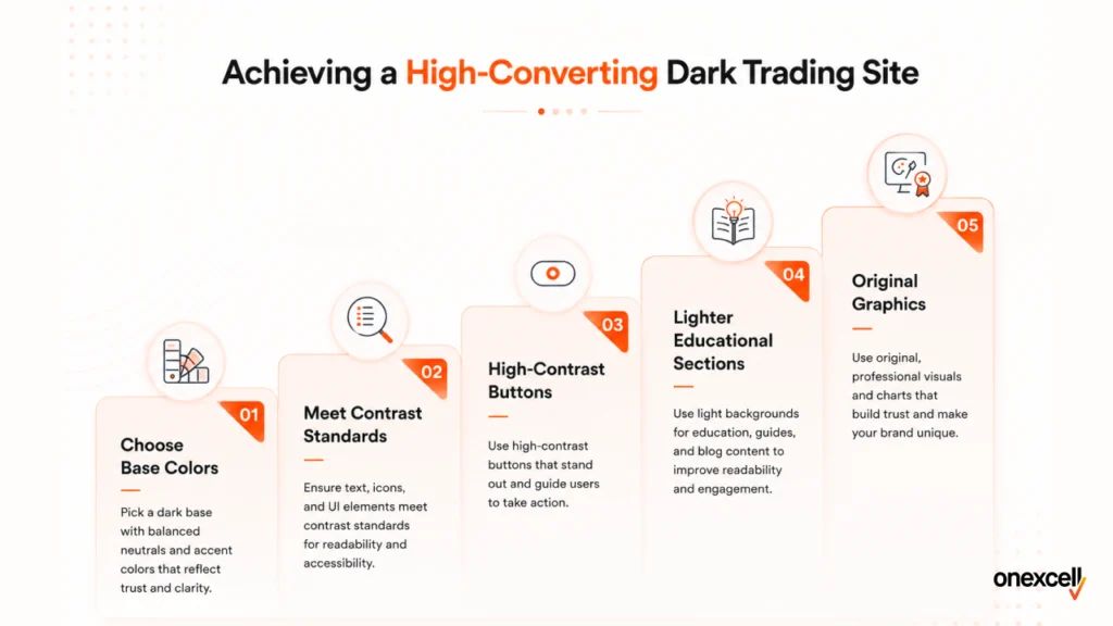
There are 5 rules for a mostly-dark site that converts:
- Use a deep navy or charcoal base, not pure black, with near-white text for readability.
- Meet contrast standards. Hit at least the WCAG 4.5:1 ratio for text and more for small text.
- Keep buttons and links high-contrast, since interactive elements often fail accessibility in dark themes.
- Use lighter sections for education, FAQs, and long reading, so text stays easy to follow.
- Invest in strong, original graphics built for your chosen style, not generic stock that suits any background.
Research shows that while most dark interfaces get body text right, interactive elements like buttons and links frequently fail contrast checks. Those are exactly the elements that drive conversion, so they deserve the most attention.
Get a trading website that looks the part and converts
Onexcell is a UK web design and development agency that builds forex broker and prop firm websites with premium, conversion-focused interfaces. We design one strong, committed style done to a high standard, with rich graphics and creative that work, rather than two compromised themes. The team works with brokers worldwide, with deep experience across the Middle East in the UAE, Qatar, Oman, and Kuwait.
Want a UI that wins serious traders? Use the form at onexcell.co.uk to send your question. The team replies within one business day.
Dark vs Light UI: A Quick Comparison for Brokers
Here is how the two modes compare on the factors that matter most for a brokerage website.
| Factor | Dark UI | Light UI |
| Brand feel | Premium, focused, modern | Clean, open, conventional |
| Trading platform | Preferred by traders | Rarely used for charts |
| Long sessions | Comfortable in low light | Can cause glare at night |
| Long-form reading | Harder for big text blocks | Easier and clearer |
| Daylight and mobile | Harder to read in the sun | Clearer in bright light |
| Graphics and creative | Bold visuals shine | Clean, lighter visuals |
| Best used for | Platform, dashboard, hero | Education, FAQs, articles |
What UI Mistakes Hurt Trading Website Conversion?
The biggest mistake is treating color as a style choice instead of a conversion decision. There are 6 UI mistakes that cost trading sites conversions, listed below.
| Mistake | Why does it cost you conversions |
| Going fully dark | Reading and trust pages suffer when forced into pure dark. |
| Pure black with grey text | Low contrast strains the eyes and fails accessibility. |
| Dark and light toggle | Supporting both waters down graphics and weakens the brand. |
| Weak, generic graphics | Visuals built to suit any mode look cheap, not premium. |
| Ignoring accessibility | Poor contrast excludes users and risks compliance issues. |
| No A/B testing | Guessing instead of measuring wastes conversion potential. |
Must read this blog: How Do I Choose A Good Forex Web Development Company?
Frequently Asked Questions About Trading Website UI
1. Is Dark Mode Better for a Forex Website?
Dark is better for the Forex trading platform Website and the premium hero, because traders prefer it, and it feels professional. But a fully dark website is a mistake, since education, FAQs, and trust pages read better in lighter sections. The strongest approach is mostly dark, with lighter areas where reading and clarity matter.
2. Why Do Trading Platforms Use Dark Themes?
Trading platforms use dark themes because traders spend long hours on data-dense screens, often at night. Dark reduces glare and visual noise, helps traders focus on price movement, and projects the serious, professional feel traders expect. It is the natural default for the trading screen itself.
3. Should a Brokerage Website Be Fully Dark?
No. Fully dark suits the trading platform, but works against the rest of a brokerage site. Long-form reading, regulation, and about pages, and daytime or mobile browsing all do better with lighter sections. Use mostly dark, with lighter areas where they help, rather than forcing pure dark everywhere.
4. Should I Offer a Dark and Light Toggle on My Broker Site?
For a brokerage site, usually not. Supporting both a dark and a light version forces you to simplify graphics so they work in either mode, which weakens your design and makes the brand look generic. It is better to commit to one strong, well-crafted style, typically mostly dark with lighter reading sections.
5. Does Dark Mode Increase Conversion?
Dark mode can increase conversion when it suits the page and the audience, especially on the trading platform and premium pages. But it lowers conversion if it is hard to read, used on long-form content, or built with weak contrast. The right balance, done well and tested, is what lifts conversion.
6. What Colors Work Best for a Dark Trading UI?
Use a deep navy or charcoal base rather than pure black, paired with near-white text for readability. Add high-contrast accent colours for buttons and links so they stand out and pass accessibility checks. Avoid thin grey text on black, which strains the eyes and hurts conversion.
Must read this blog: How Much Does It Cost To Make A Website?
Final Word: You Have the Full Picture, Now Choose Your Balance
Dark versus light is not a single winner. Traders clearly prefer dark for the trading platform, and dark gives a brokerage its premium, focused feel. But a fully dark website works against the reading and trust pages that also sell your brand, and trying to ship both a dark and a light version usually weakens your design. The strongest path for most brokers is mostly dark, crafted to a high standard in one committed style, with lighter sections where reading matters.
Here is the full picture in 6 points, so you can decide what suits your traders:
- Keep the trading platform and dashboard dark, because traders prefer it there.
- Make the homepage and hero premium and mostly dark to set the brand tone.
- Use lighter sections for education, FAQs, and long-form reading.
- Avoid going fully dark, which hurts readability and trust pages.
- Avoid a dark and light toggle, which waters down your graphics.
- Commit to one strong style with original graphics, then A/B test the details.
Now you have everything on the table. Weigh it against your audience, your content, and your brand, and choose the balance that fits. Whatever you pick, do it properly: one well-crafted style will always win more traders than a half-finished compromise.